Sometimes I notice a feature on a site, a small design tweak and think to myself “Wow, that’s neat!” So here are a few ideas that online store owners could borrow for their sites.
1. Amazon uses faux 3D animations to guide the user to view the back and internal book details. 2. When you are shopping on Asos you can hide all products from a specific brand.
3. Amazon will show you the item counter inside the shopping cart.

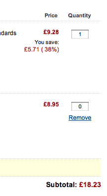
4. When changing an item’s quantity in the basket to 0, a link to remove the item appears on Amazon.

5. On Projecto when shipping to a UK address you get a warning about import tax that might apply.
6. After completing your order, the page title changes to: “Amazon.com Thanks You”
![]()

