When it comes to designing high converting press here button, there is no golden rule to follow which guarantees ultimate success.
Different markets have different audiences, therefore different things must be taken into consideration in a process of great press here button design.
1. Color
Numerous studies have confirmed that different colors can inspire different emotions. Therefore, choosing a right color for you press Here button is more important than you could think.
Based on various case studies, it is reported that green and orange buttons tend to perform best. However, if dominant color on your page or overlay is green, it’s important to make sure that your press here button stands out, and converts well.
Marketers believe that contrasting color is the best way to make your call to action button stands out.
The trick is to find a contrasting color that works with overall design of your website.
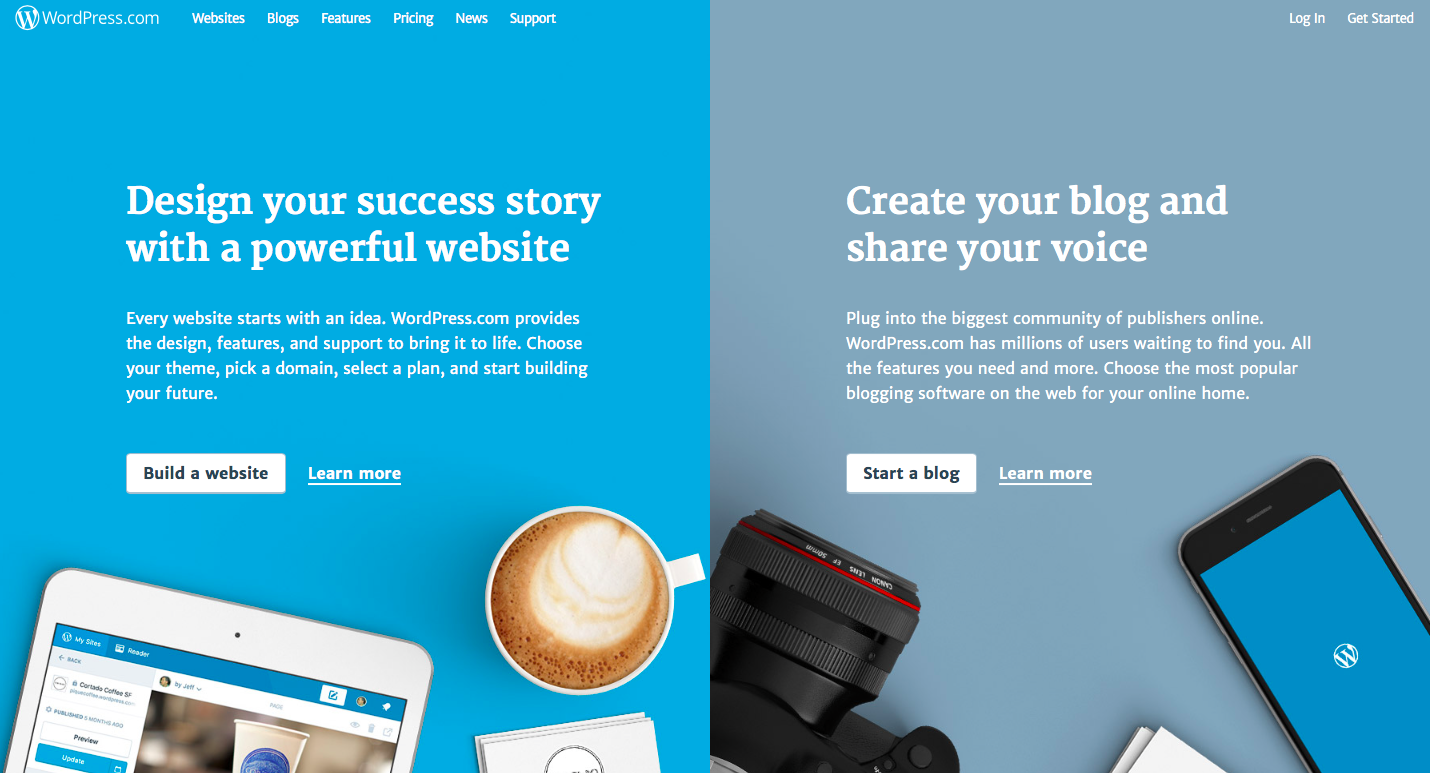
A great example of such practice is WordPress. White CTA buttons not only seamlessly blend into website’s design but also immediately captures visitors attention.
Another thing to take in consideration when choosing press here button’s color is your brand personality. What are the colors you visitors associate your brand with?
Let’s say your brand is exclusively associated with masculinity (not that women wouldn’t buy your product or service). Most likely you will not choose to use pink or baby blue as your CTA button’s color.
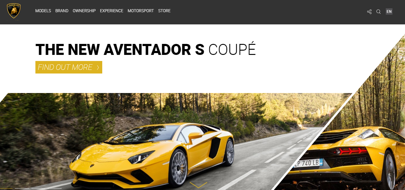
Even though yellow is not considered a particularly manly color, it works perfectly for Italian luxury sports car brand Lamborghini, simply because it is their signature color. Therefore, in this case having yellow CTA button works.
Now imagine your brand is an example of classy and delicate, perhaps prestigious.
Bright blue, green or orange button would stand out but certainly wouldn’t match your brand’s personality.
2. Size
Everyone could probably agree that barely visible press here button will not do the job. The whole point of using CTA is to capture the attention of the visitor. And so, how big should the button be?
Ideally, your call to action button should be the largest button on your page. However, it should not overpower everything around it. Also, keep in mind that press here button might appear bigger or smaller depending on the device your prospect might be using. Therefore, choose wisely.
3. Shape
Your CTA can be round, circle or square if you’d like.
As long as visitor can easily recognize it as a button, you are good. Of course, you can try to establish new trend for CTA buttons, but in the end, it is all down to the number of conversions your press here button brings.
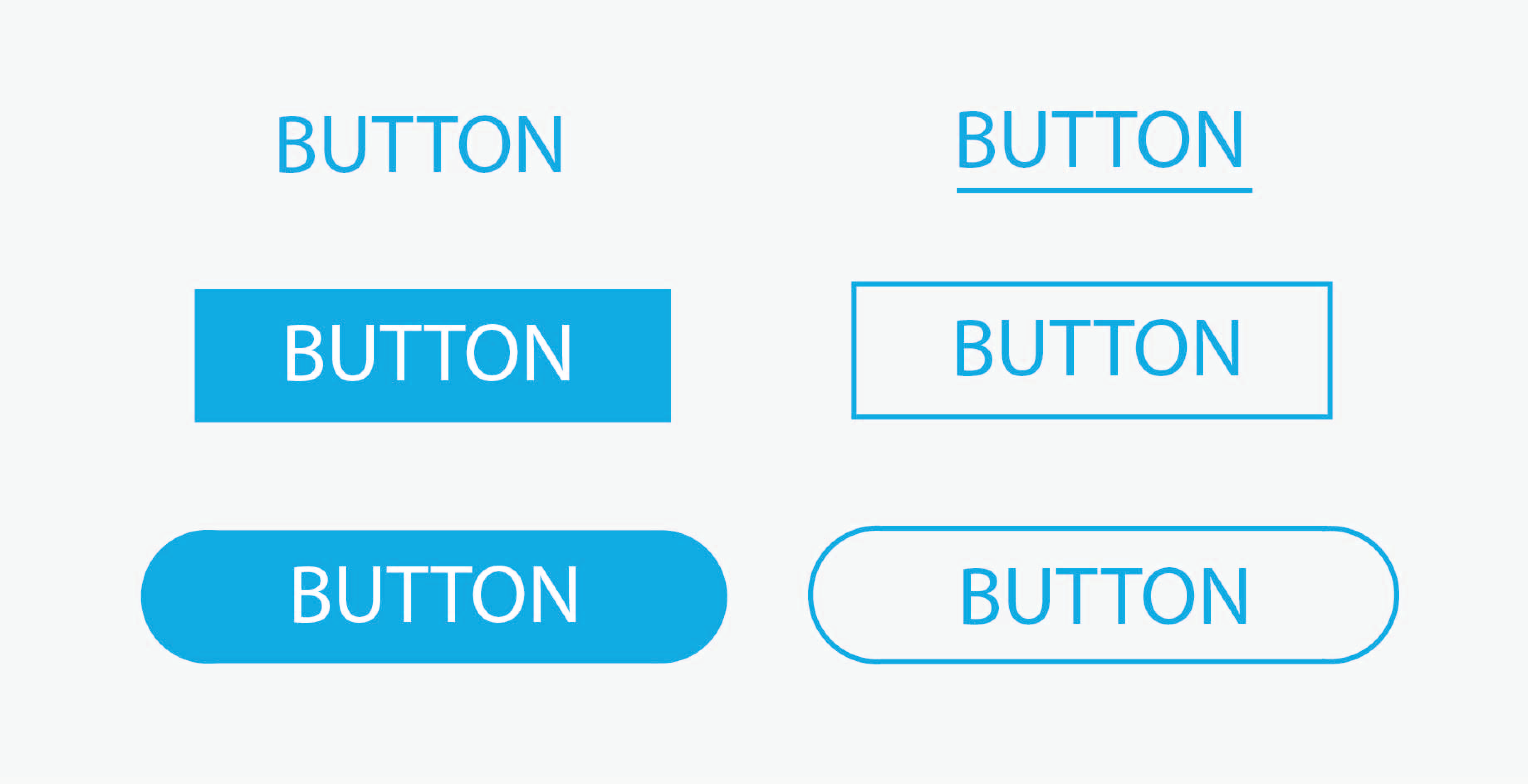
If you want to play it safe, make your buttons square. It is one of the most popular shapes of buttons, as it is easy to recognize as a clickable object.
You can also make your press here button as a square with rounded corners, since it is reported that rounded corners enhance information processing and draw our eyes to the center of the element, in this case – CTA button. Oval shape buttons seem to be used more frequently too.
Press Here Button Summary
With so many variables to take in consideration, designing high converting call-to-action button can be more challenging than you could have thought.
Be observant and well aware of your audience and overall brand image.
So, once again, pay attention to these aspects when designing your press here button:
- Color
- Size
- Shape
Finally, consider conducting an A/B test for your calls-to-action. Let your audience decide what is more appealing to their eyes by learning which design of your CTA has higher conversion potential.
Moreover, if you want to learn more about how to create Purchase button that sells, this article is a must read.