One of the most important things you need to know about web design is that there are two major components, which tower with their importance above everything else. And these are appeal and functionality.
According to one statistic, human mind registers visual information 60,000 quicker than a textual one, which means that by the time your audience reaches your content, they already have an opinion about your website.
On the other hand, the design of your website doesn’t mean much if it can’t load in the first place or if it is incredibly slow to respond to the command of your visitors. For instance, an average internet user expects your website to loads within first 2 seconds and failing to do so in 4 seconds might result in a serious increase in bounce rates. Unfortunately, some of the most stylish elements of your website might be slowing it down. That would mean that you have to sacrifice aesthetics to functionality.
At the end of the day, if you are forced to choose, which one matters more, optimization or visual trend? Furthermore, are minimalist designs (which are always less resource-intensive) necessarily better for SEO, as so many people suggest? Let’s find out!
1. Minimalism in web design
Probably the first web design trend that needs to be addressed, when it comes to a combination of visuals and web optimization is minimalism. Due to the low average number of HTTP requests on a minimalist web page, they tend to be much more responsive. This alone gives your SEO efforts a great boost.
There are of course some SEO difficulties here, as well. For instance, you are not only required to make your visual elements but also your content minimal. While ‘fluff’ text is never advisable, the minimalist design requires you to cut down on adjectives as much as possible. This creates a situation where an organic use of long-tail keyword becomes incredibly difficult. This is yet another reason why you should consider hiring someone capable of providing premium SEO services, instead of trying to DIY pull this on your own.
On the other hand, having fewer options (less clickable elements) can make your navigation more intuitive, seeing as how it will be quite transparent where one should go next. Apart from this, one major study did a research on two test groups. One of them had 6 different varieties of jam to choose from, while others had 24 different types. Needless to say, the first group was over ten times more likely to actually make a purchase. In this way, keeping your web design minimal might help increase your conversion rates.
2. Flat web design
Right after minimalism, it is important that we address the flat design trend that is becoming ever more popular. The reason behind this is a fact that flat design A) doesn’t require complicated and resource-intensive 3D animations and B) is extremely mobile friendly.
The latter feature makes flat design incredibly convenient, due to the fact that most audience online currently browses the internet through mobile devices. In fact, earlier this year, it was announced that Android is a more popular web-browsing OS than Windows. Needless to say, this is something most of us never expected to see in our lifetimes.
Through simplicity, this design can be visually appealing, especially with methods such as split screens or matching the color with product quality. On the other hand, while it does look quite simple, it can still draw heavily on your website’s resources. This mostly depends on how much 2D animation you want to go with. Therefore, those who don’t think their hosts can pull off some wild animation stunts might do better to simply take a minimalistic approach to this design trend.
3. Brutalism in web design
Another trend worth looking out for in 2018 is definitely brutalism. Inspired by Soviet-era Eastern Europe architecture, the characteristics of this trend are bland colors, odd shapes and overall captivating first impression (not necessarily in a positive manner). With over 1.3 billion active websites out there, grabbing the attention of your audience is quite difficult on its own. Therefore, sometimes simply sticking out might be a winning trait. This is also why brutalism is so popular with millennial and teen audiences.
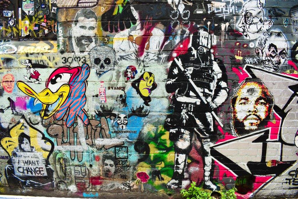
While in architecture the predominant color may be grey, here, the same rule doesn’t always apply. The color of a building constructed in a brutalist fashion is conditioned by the color of materials used (mostly concrete). With web design, however, you have no such constraint. That’s why you should go with something completely extraordinary, even inconceivable like pink and blue or yellow and violet. The key here is to evoke a strong emotion upon the first sight, which is something we already addressed in the introduction.
At the end of the day, brutalist design, although somewhat random and even odd looking, isn’t necessarily resource-intensive. Still, one can’t consider it as stylish and friendly either, seeing as how it refuses to abide some of the most widely accepted web design norms. Therefore, the best way of describing it would be with the use of a word unique.
4. Cinematic experience in web design
In the end, you need to keep in mind that a smaller percentage of people read today than ever before. In fact, 8 out of 10 people won’t even bother to read past the headlines. One of the best ways to go around this is by providing your audience with a cinematic experience. According to one survey, an informational video at the homepage (before you present your audience with a CTA button), can boost your conversion rates by an incredible 144 percent.
Unfortunately, there are several difficulties tied to this method, as well. First of all, just throwing any video at your audience won’t be able to do the trick. This means that you either have to hire someone to do the directing, editing and even acting or train your team in some of these tasks. As you might have guessed, all of this is both time and money consuming. Furthermore, a quality video in high resolution might make your website take much longer to load and even overall less responsive.
Even with these two downsides, more and more companies are currently turning towards including a video on their homepage. Not only is this a great way to introduce your company but it also allows you to do so by appealing to all of their senses at once. In this way, you are creating a much stronger experience. As Maya Angelou once said: “People will forget what you said, people will forget what you did, but people will never forget how you made them feel”.
Conclusion
At the end of the day, it is completely impossible to give a definitive answer. And that means ideally, you should always look for a middle ground.
If your web design is efficient and quick, yet ugly, counter-intuitive and confusing, you will lose audience just as quickly as if it takes forever to load. So, instead of looking for a metric that will allow you to choose between the two, you need to find a way to combine them, without having them interfere with one another. Finally, there is also the nature of your industry and audience to take into consideration, which is, yet again, a story for another time.
About the author
Lena Hemsworth spent a better part of her life working as a business consultant and web designer in Sydney. Now she is a freelance blogger and copywriter who enjoys following trending topics and sharing knowledge. When she is not working she is playing with her dogs on a beach.
