The primary goal of most websites is to convert incoming visitors into customers. Chances are your marketing efforts are successfully bringing new traffic to your site. But do you see an increase in a number of qualified leads? If no, you are probably facing a problem most websites do. Incoming visitors are not sticking around for longer nor are they eager to convert.
There’s nothing more frustrating than investing time and effort into something and coming out empty-handed. Luckily, there usually is a logical reason why your visitors are not willing to take the plunge. And here are the 5 most common ones!
1. You are targeting the wrong people
You can design a beautiful poster or create a powerful slogan but it might not communicate any value to your target audience. Or even worse, it might simply not reach it.
It’s not a surprise that by trying to please everyone under the sun you might end up wasting not only your energy but money, too. Therefore, all your marketing effort should be carefully aligned to a specific audience or groups within it.
What can you do?
One of the keys to effective marketing communication strategies is to understand your audience or like marketers like to call it – buyer personas. The buyer persona is a semi-fictional character that represents the ideal customer. The characteristics of buyer persona should be based on both market research and real data of your existing clients. It should also include the analysis of the buyer’s journey.
Once you’ve pinned down your buyer personas, you are more ready to present them with relevant information in the most appealing way. And don’t forget that your targeting efforts should be also aligned differently depending on whether it’s a customer-to-be or someone who has already bought from you.
2. Your website isn’t mobile friendly
Smartphones are within our reach wherever we go. We check our emails, read restaurant reviews, look up things that caught our attention. And according to studies, we shop more using our smartphones, too. In December 2016, mobile e-commerce sales rose 47%. This means that no website has the luxury to overlook the growing number of smartphone users. Especially if they want to keep their conversion rates growing.
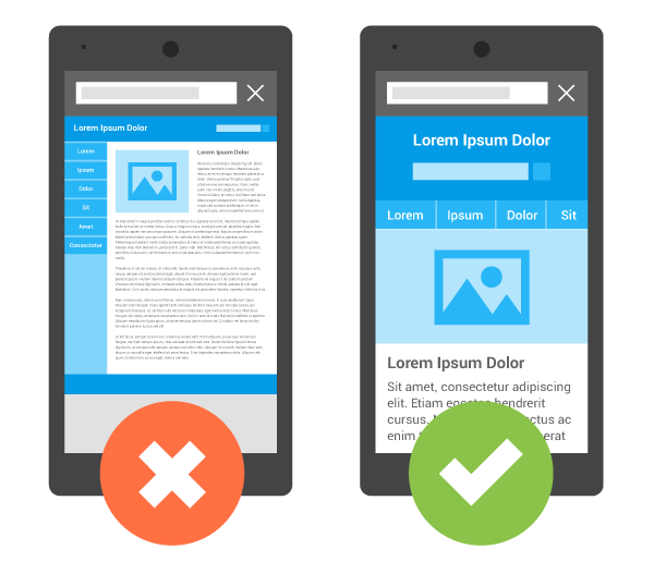
As we already know, websites that are difficult to access and navigate tend to convert worse than the ones which are user-friendly. The same can be said about websites accessed through mobile devices. Therefore, to assure pleasant user interaction with a website on mobile, businesses should develop mobile-friendly sites.

If you are not sure whether your website is mobile-friendly or not, take Google mobile-friendly test to find out.
What can you do (if the answer is no)?
As you can probably guess, the only way to go around this matter is simply making your website mobile-friendly. According to Google “On a very basic implementation level, transitioning an existing desktop site to mobile entails using existing sections of content from the desktop site and organizing them in a mobile-friendly design pattern.” In order to make your website mobile friendly, you will most likely need to speak with your website developer. But don’t worry, with a help of easy to follow guide how to make your website mobile-friendly, you should get it done hassle free.
3. Customers don’t trust your page
Believe it or not, credibility and trust of your website play one of the most important roles in helping your prospect decide whether he should purchase from you or your competitor. It’s especially important now that we live in the world of internet business. With competition so high, there are numerous options not only in goods or services offered but also where to get them from.
What can you do?
There are several ways you can build trust in your website and sell more. Most commonly, websites are encouraged to do the following three things:
Mind the design. According to the results of various researches, your clients are evaluating your website in a matter of seconds, which means your website has little time to achieve big results. Therefore, the chances are dodgy illustrations, low-quality images, and flashing colors won’t be doing any good for your website. Not to mention a confusing layout of the page. Take user experience serious, as it can be either way the reason incoming visitors stays or goes.
Assure payment safety. You might have high-quality products or services to offer and a user-friendly website to shop at. However, if you cannot provide secure payment connection you are likely to face some difficulties to convert more visitors. That is why make sure you set up a trusted online payment system that is widely recognized by your customers.

Collect product/service reviews. Gathering customer reviews is yet another way that can help you build a trustworthy image of your brand. When it comes to window shopping, reviews of your product left by your previous customers matter more than you think!
4. There are too many distractions
We get it. With competition so high, every marketer tries to do what it takes to prove website visitors that his company product or service is the one. Unfortunately, quite often it results in businesses simply bombarding incoming visitors with information that might not be relevant or simply overwhelming. Big variety of illustrations, fonts, and colors can be as distracting, too.
Even if there are CTA buttons or contact forms on every page of your website, users might still not see them due to a number of other elements on the website. As a result, incoming users are likely to be distracted in the process of conversion finalization.
What can you do?
The easiest thing you can do is to change up your website design by removing certain elements. If you are not sure which website element is better to keep or get rid of, run an A/B test to find out. Change one element at the time and let your visitors decide what they like more.
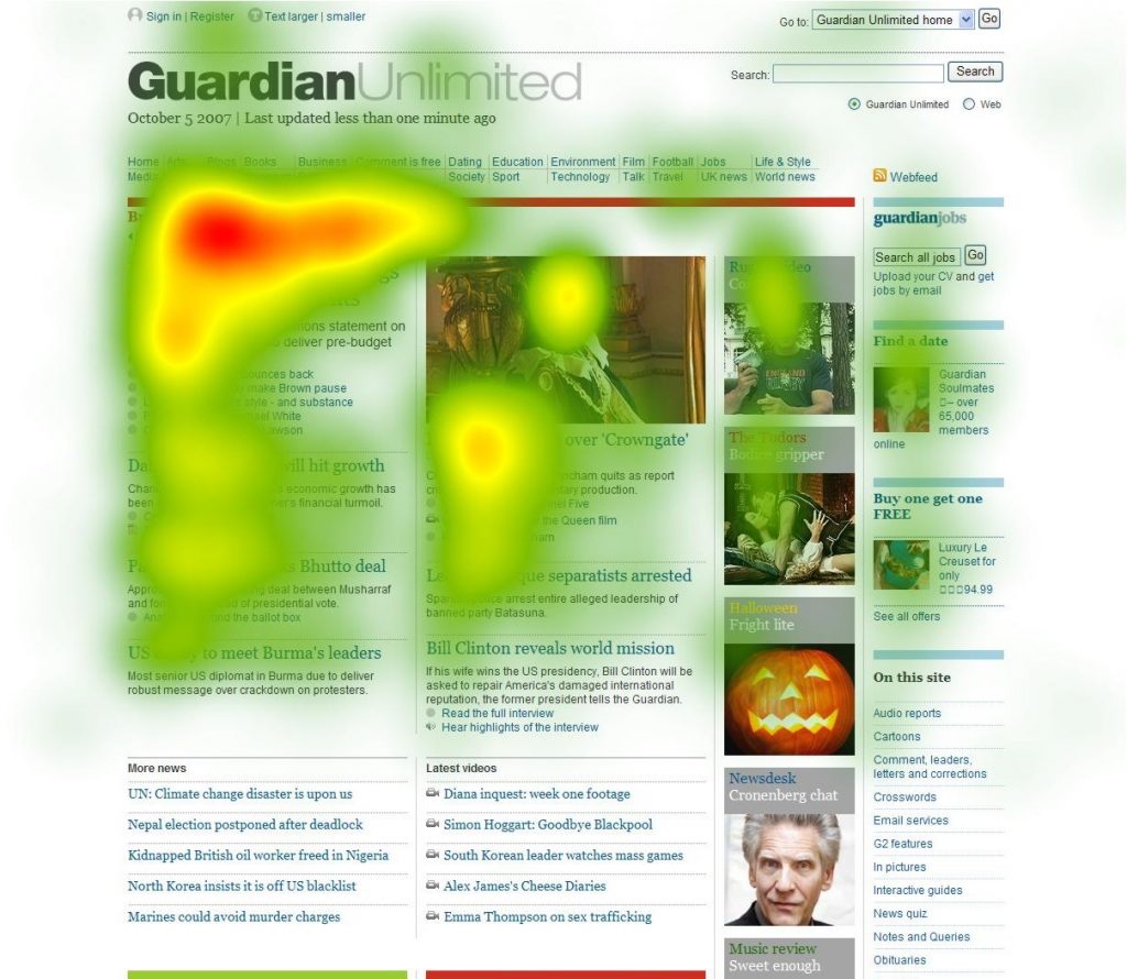
You can also use heatmaps to learn which website elements attract more attention of the visitor and which distract them.

Depending on users behavior on the site, you should make certain changes that might positively affect your conversion rates.
5. Users don’t have a chance to convert
That’s right! Your conversion rates might be low because visitors simply don’t have a chance to convert on your website. This can be due to poor incentives that either way don’t direct the incoming visitors towards the conversion, or are difficult to recognize and spot.
What can you do?
Simply put, you have to make it easy for the visitors to convert. To begin with, take a look at your website to learn how many opportunities your user has to convert. What about your CTA buttons? Are they visible and encouraging enough to lead a visitor towards conversion? If you are not confident about the strength of your CTA, find some useful tips in the guide to high converting CTA.
To create an additional opportunity for the incoming visitor to convert, consider using exit popups that appear when your visitor is leaving the website immediately or after a certain amount of time spent on the page.
Not getting the conversion rates you’ve been hoping for? Everything that has been mentioned in this post should give you a guidance what needs to be changed to keep your website striving. You will be surprised, how small things can make a difference to your conversion results. Once you put these corrections into place, you’ll be able to make the most of your existing traffic. But don’t stop there. Constantly test your website, because the truth is, it can always be better.
