
Call-to-action or CTA is a short combination of words which captures the attention of the prospect and encourages him to take a certain action which eventually leads to conversion.
Assuming that your website visitors know what should be their next step is wrong and outdated. Today every website should have call-to-action that suggests the prospect what he needs to do in order to benefit from a certain product or service offered. By creating visible and attractive call-to-action companies make things easier for the prospects, but most importantly, they get a better opportunity to convert them right from the start.
But what does it take to create a high converting call-to-action? Answers to all of your questions are right here!
[toc]
1. Creating Call-to-Action
Creating a compelling call-to-action is not that easy. Internet users encounter numerous of invitations to try different products and services on daily basis. By now they are more knowledgeable and not so easy approach and impress.
Finding right words to use in your call-to-action can be challenging, but putting time and effort into it can dramatically increase your conversions.
Different CTA brings different conversions. Depending on your business you can create numerous variations of it. Here are some of the most common techniques used to create a conversion driven call-to-action.
1.1 Define an action
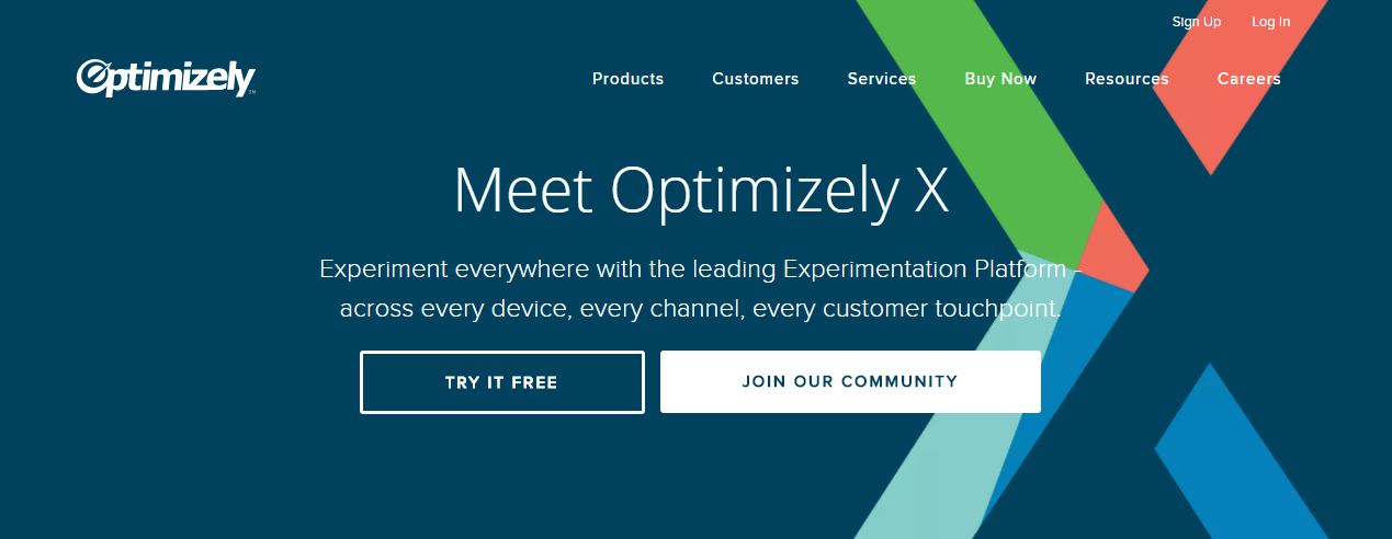
Call-to-Action is named like that for a reason. Therefore, it is no surprise that every CTA starts with a verb. It suggests your prospects a lead magnet and shows what should be their next step. Probably the most popular words used in CTAs are:
→ Try
→ Get
→ Join
→ Download
→ Access
1.2 Imply exclusivity
People want to be superior to others, they want to own something others might not be able to own. Implying that certain items or services on your website are there for a limited amount of time makes many visitors believe they are the very few lucky ones who get to enjoy it before it leaves the market for good. Also, offering something exclusive usually makes a justice to the customers to pay the high price for it.
A few phrases that can help to emphasize the exclusivity of your goods or services:
→ Limited edition
→ Pre-order
→ Members only
→ Premium access
→ Request invite
All of these phrases imply that only a certain type or number of people are eligible for the offer. In other words, they are superior to others by having an opportunity to own something that is not widely available. Who wouldn’t want to be one of them?
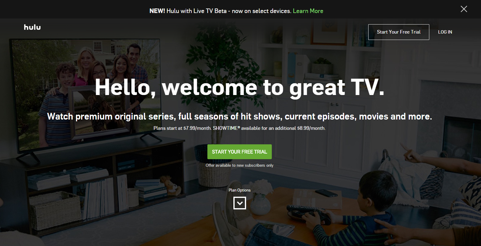
On Remarkable website, you can find 2 calls to action.
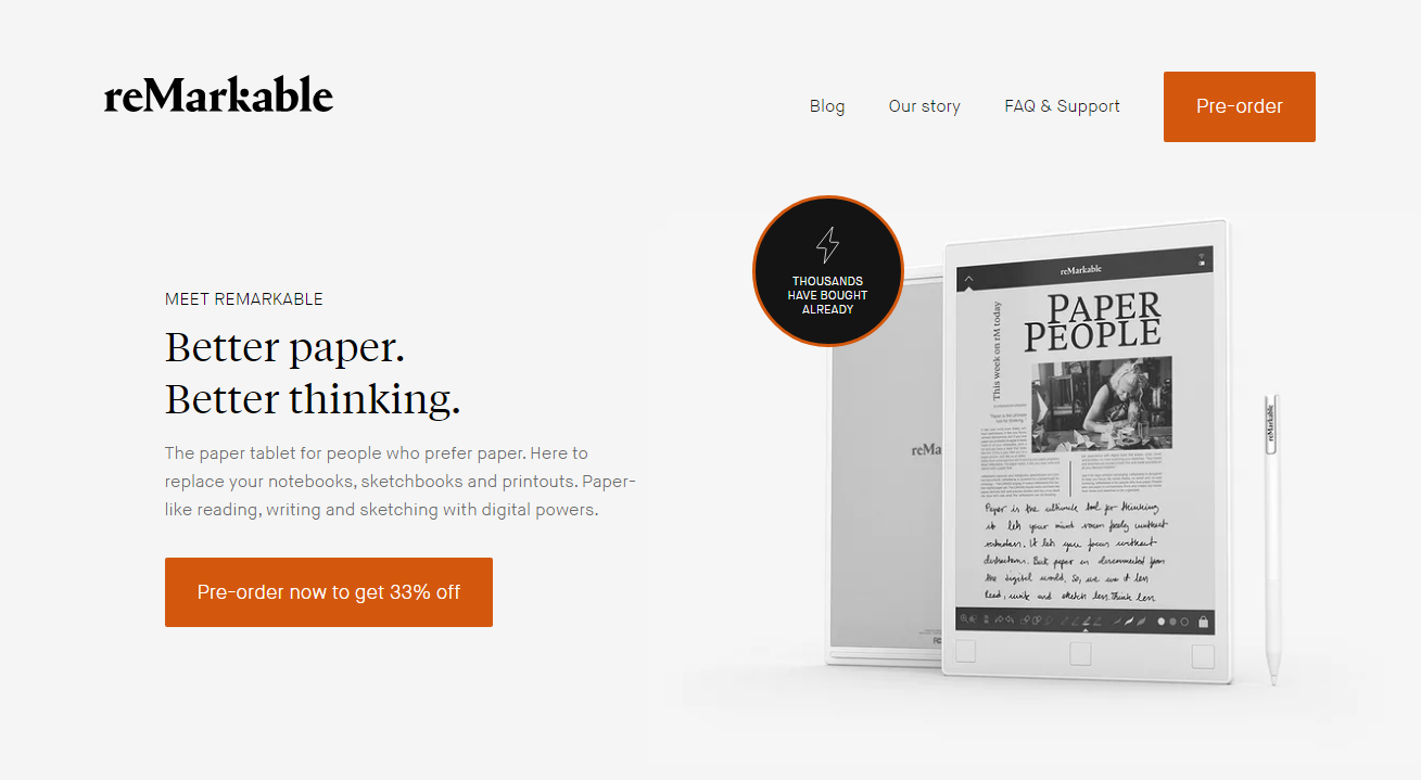
Both of which are implying exclusivity. “Pre-order now and get 33% off” encourages to purchase unique, not yet released product for the lower price! For some, this might be an offer too good to miss.
1.3 Promote urgency
Have you ever put off your purchase until tomorrow and then completely forgotten about it the following day? Well, you are not the only one. The chances are your prospects are behaving the same way when browsing your website.
Promoting urgency within your CTA encourages users to make a purchase immediately. Almost 99% of window shoppers agree that time-bounded offers have a great impact on them when making a decision to purchase a good or service.
Words or phrases that could be used when creating CTA that encourages immediate action:
→ Today
→ Offer ends in…
→ Now only…
→ Last chance
→ Closing soon
Creating a sense of urgency motivates prospects to take an action at that very moment out of fear of missing out on a good deal.
1.4 Encourage conversation
Companies should not underestimate the power of conversation. By encouraging your customers to leave a feedback, answer a certain question or submit one, you are building a closer relationship with your prospects. One way communication is an ancient practice that is not relevant in the age of social media.
The following are the most common words you can add to your CTA to start a conversation with your prospects:
→ Reply
→ Submit
→ Request
→ Share
→ Comment
There are 2 more words that work wonders when used in CTA. First honorable mention goes to:
→ You
(or me, I and my)
Personal pronouns help to create a closer connection to a product or service. According to recent studies, first person pronouns, such as I and my, beat second person pronouns you and your by 24%. However, if you are not convinced by study results, run a quick A/B test and see which pronouns work better with your audience.
And then, of course, we have to mention:
→ Free

Emphasizing that certain goods or service are available for free (even if just for a limited amount of time) give prospects a better reason to engage with your company. It also gives you a better chance to convert your prospects into paying customers later on. You have to give in order to get.
2. Designing Call-to-Action
When it comes to designing high converting CTA, there is no golden rule to follow which guarantees ultimate success. Different markets have different audiences, therefore different things must be taken into consideration in a process of creating call-to-action.
2.1 Color
Numerous studies have confirmed that different colors can inspire different emotions. Therefore, choosing a right color for you CTA is more important than you could think.
Based on various case studies, it is reported that green and orange buttons tend to perform best. However, if the dominant color on your page or overlay is green, same color CTA button would not be as visible, therefore, it wouldn’t convert as good.
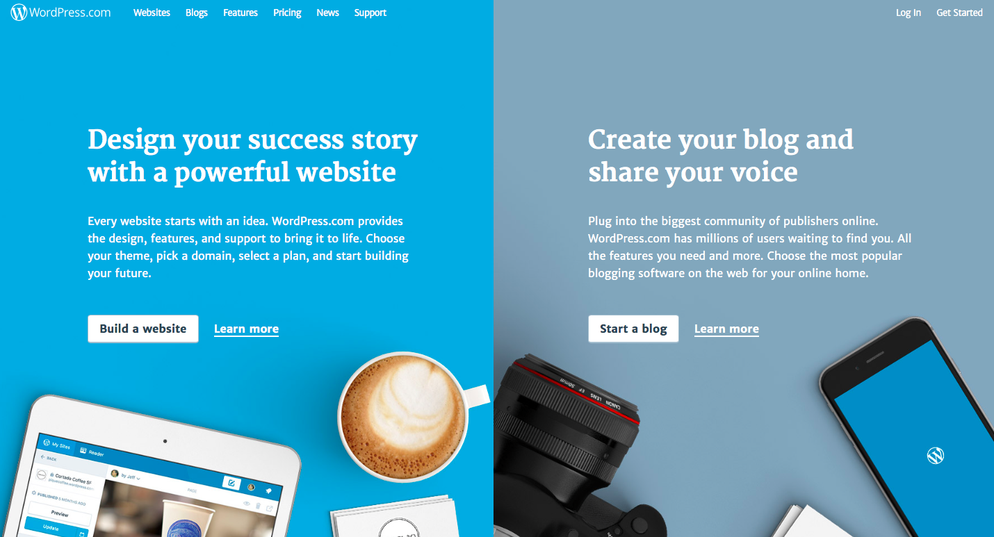
Marketers believe that contrasting color is the best way to make your CTA stand out. The trick is to find a contrasting color that stands out but at the same time, works with overall design of your website. A great example of such practice is WordPress. White CTA buttons not only seamlessly blend into website’s design but also immediately captures visitors attention.
Another thing to take in consideration when choosing CTA color is your brand personality. What are the colors you visitors associate your brand with?
Let’s say your brand is exclusively associated with masculinity (not that women wouldn’t buy your product or service). Most likely you will not choose to use pink or baby blue as your CTA button color.

Even though yellow is not considered a particularly manly color, it works perfectly for Italian luxury sports car brand Lamborghini, simply because it is their signature color. Therefore, in this case having yellow CTA button works.
Now imagine your brand is an example of classy and delicate, perhaps prestigious.
Bright blue, green or orange button would stand out but certainly wouldn’t match your brand’s personality.
2.2 Size
Everyone could probably agree that barely visible CTA will not do the job. The whole point of using CTA is to capture the attention of the visitor. And so, how big should the button be?
Ideally, your call-to-action button should be the largest button on your page. However, it should not overpower everything around it. Also, keep in mind that CTA might appear bigger or smaller depending on the device your prospect might be using. Therefore, choose wisely.
2.3 Shape
Your CTA can be round, circle or square if you’d like. As long as visitor can easily recognize it as a button, you are good. Of course, you can try to establish new trend for CTA buttons, but in the end, it is all down to the number of conversions your CTA brings.
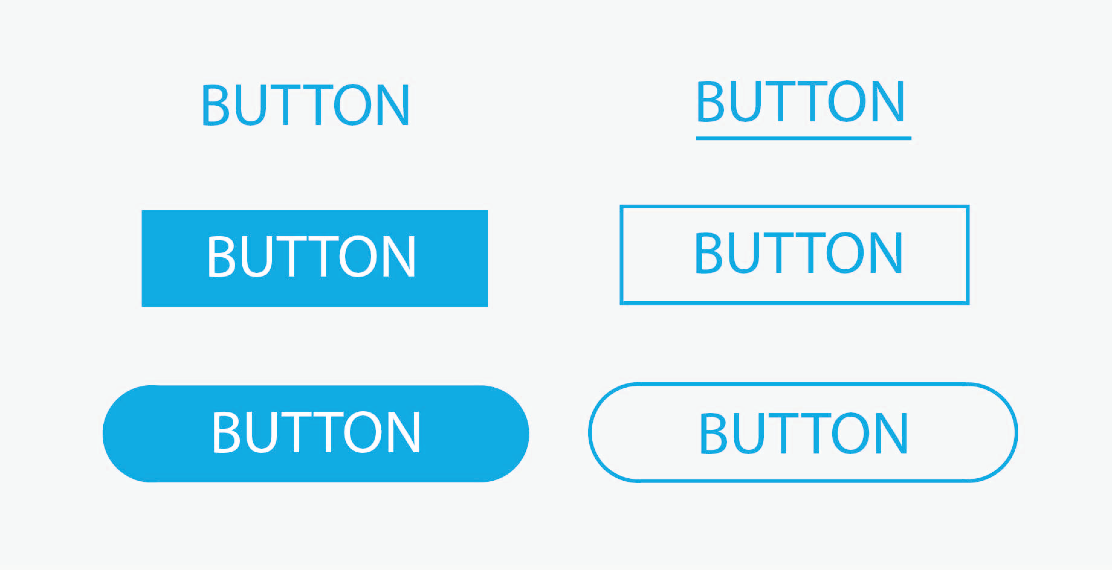
If you want to play it safe, make your buttons square. It is one of the most popular shapes of buttons, as it is easy to recognize as a clickable object. You can also make your CTA square with rounded corners, since it is reported that rounded corners enhance information processing and draw our eyes to the center of the element, in this case – CTA button. Oval shape buttons seem to be used more frequently too.
3. Placing Call-to-Action
If you pay a close attention to most of the websites, you will learn that call-to-action is usually placed either in the middle of the site or at the top right corner of it. Sometimes, as you will see in examples below, CTA is placed both in the middle of the page, as well as the top of the page. And at times it is even visible in three different places. Why?
Well, there are different approaches to CTA placement strategies and each business is free to choose what is more suitable for its product and audience.
Studies show that CTA placement is highly dependent on the complexity of the product or service offered. It means that CTA and can be as effective when placed above the fold as placed below it. Let’s take a moment to unravel this statement.
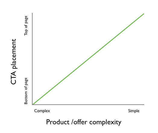
3.1 Complex product or service
The more complex the good offered is, the more information prospect needs to decide whether or not he or she is interested in it. In this case, a homepage with the name of the product or service and the image of it will not do a justice for the visitor.
Let’s take a look at the homepage of email marketing service MailChimp.
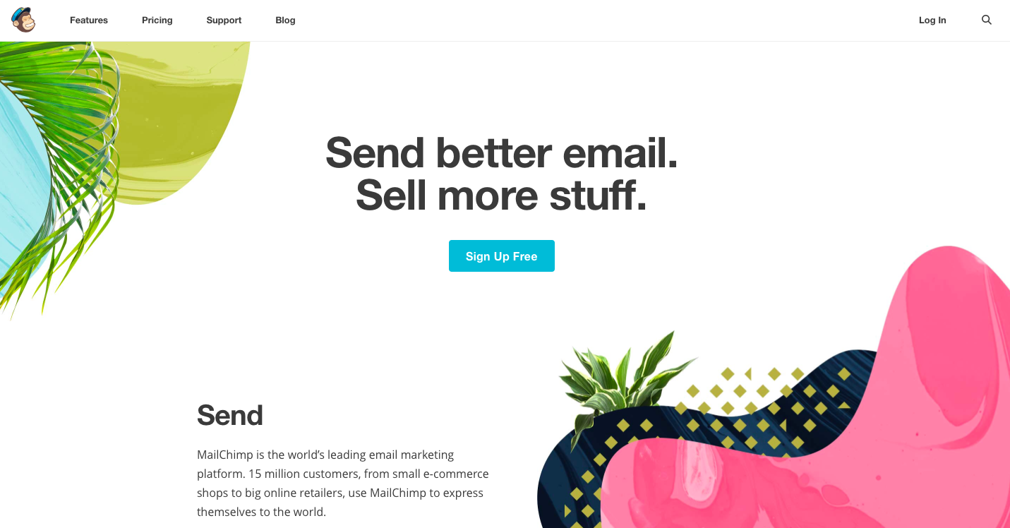
Once you open MailChimp homepage you immediately can notice their CTA – “Sign Up Free”. The service offered could be interesting for various types of online businesses. This CTA is aimed at those prospects who have heard about MailChimp before and need little to no convincing to try it. On the other hand, uncertain visitors are likely to look for more information about MailChimp service before they decide whether or not it is appealing to them.
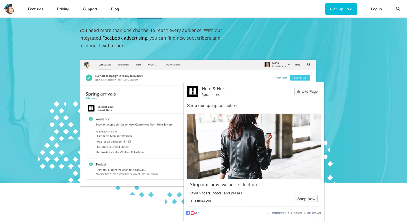
As you scroll down the page, you get to learn more about the company and its service. The same CTA appears at the very top of the page and it remains visible throughout the whole length of the page. This CTA is smaller in size and is less intrusive, as a company is giving time to their prospects to get more familiar with their service. If at any point visitor makes his mind to try MailChimp, he can sign up for a free service at that very moment by clicking on CTA at the top right corner.
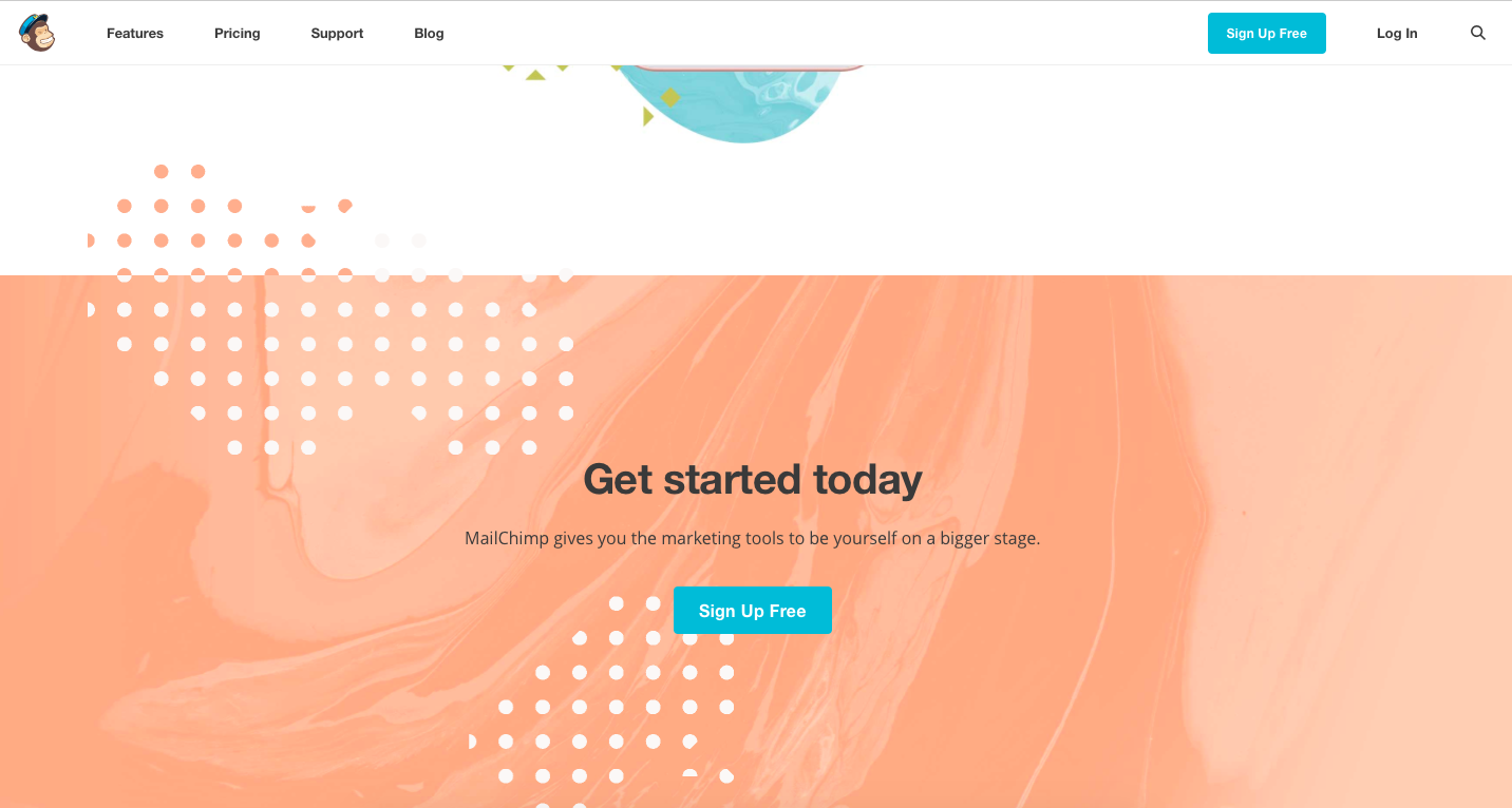
Finally, at the very bottom of the page visitor can see three calls-to-action: a headline “Get started today” and two “Sign Up Free” buttons. Why three at a time? As a visitor has come to the very bottom of the page, it is likely to be the final point of interaction with him. Therefore, it is the last shot for the company to convert the visitor to customer.
This is quite a common CTA placement strategy for companies that offer rather complex products (more placement tips here).
3.2 Simple product or service
If your product is well known or is not as complex, prospects do not need additional information to make up their mind whether or not product is interesting to them. By now they are most likely familiar with it, and chances are they are on your website for a reason – to start using your service or purchase a good. Take a look at the example below.
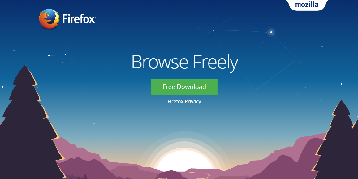
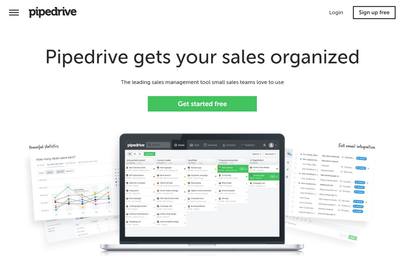
Firefox is a free open-source web browser. It is also second most popular browser amongst internet users. There is little to no information about the product on the homepage and the most visible and inviting piece of information is CTA button.
4. Understanding primary and secondary Call-to-Action
Multiple calls-to-actions can be found on websites, overlays, and even commercial emails. In most cases, they do not carry the same weight, which means one of them is more important than the other.
4.1 The concept of primary and secondary CTA
Primary call-to-action is meant to encourage the most desired action you want visitors to take. It leads your prospect towards the conversion. Secondary CTA provides an alternative action for the prospects to take. It usually is less visible and prominent than primary one and can be helpful when engaging with those prospects who are not interested in an original offer.
Primary and secondary calls-to-action can be divided into two main categories, complimenting and contrasting, depending on their relation to one another.
4.2 Complimenting calls-to-action
This concept of primary and secondary calls-to-action is based on the belief, that not everyone is interested in the same offer. Even though primary CTA is an ultimate outcome company expects from the visitor’s actions, the secondary can be helpful to further direct prospects toward a successful original conversion.
Video chat and voice call service provider Skype uses complementing CTAs on their website.

The moment visitor opens the homepage he is immediately introduced to two options – two calls-to-action. Primary invites to download the application, which is the ultimate outcome company expects to receive from the prospect. Secondary, on the other hand, encourages to “Start a conversation” instead. By clicking this button, visitor can enter a conversation room where he can exchange messages with his friends (which he has to invite to join him by sending a link to the conversation).
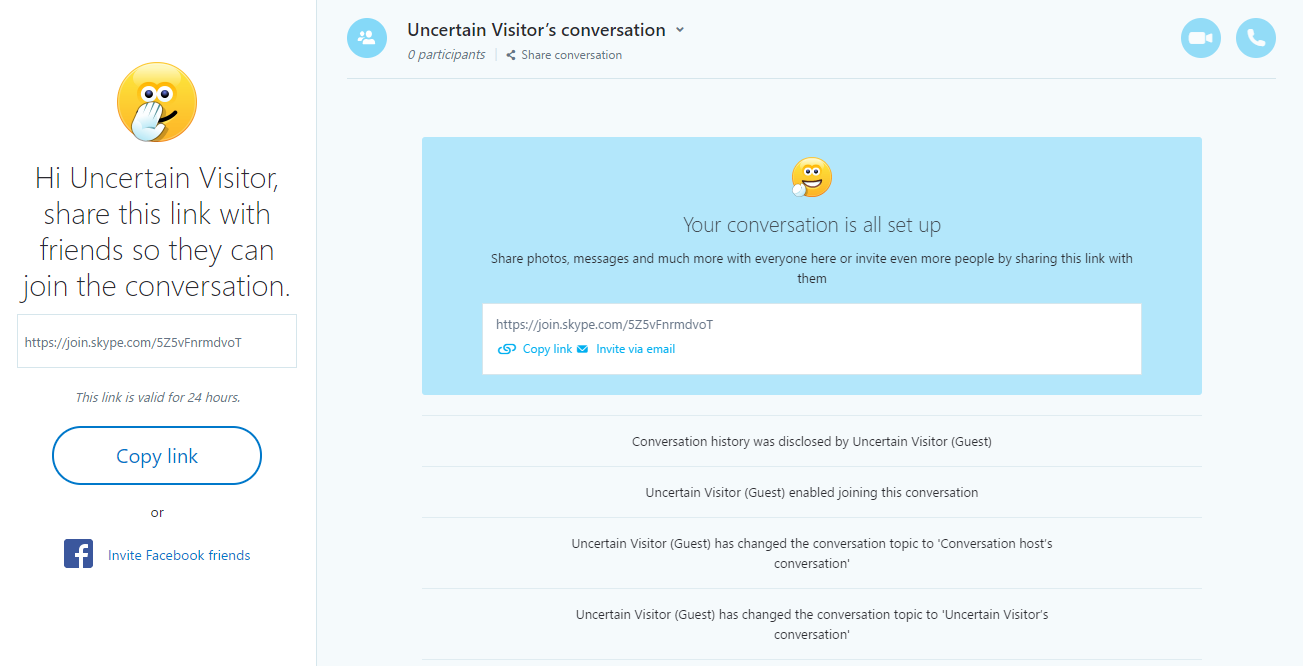
This particular offer allows prospects to try Skype without having to download or install it. It is a great introduction to the product that can eventually lead to conversion.
Woopra also uses complimenting primary and secondary calls-to-action on their landing page.
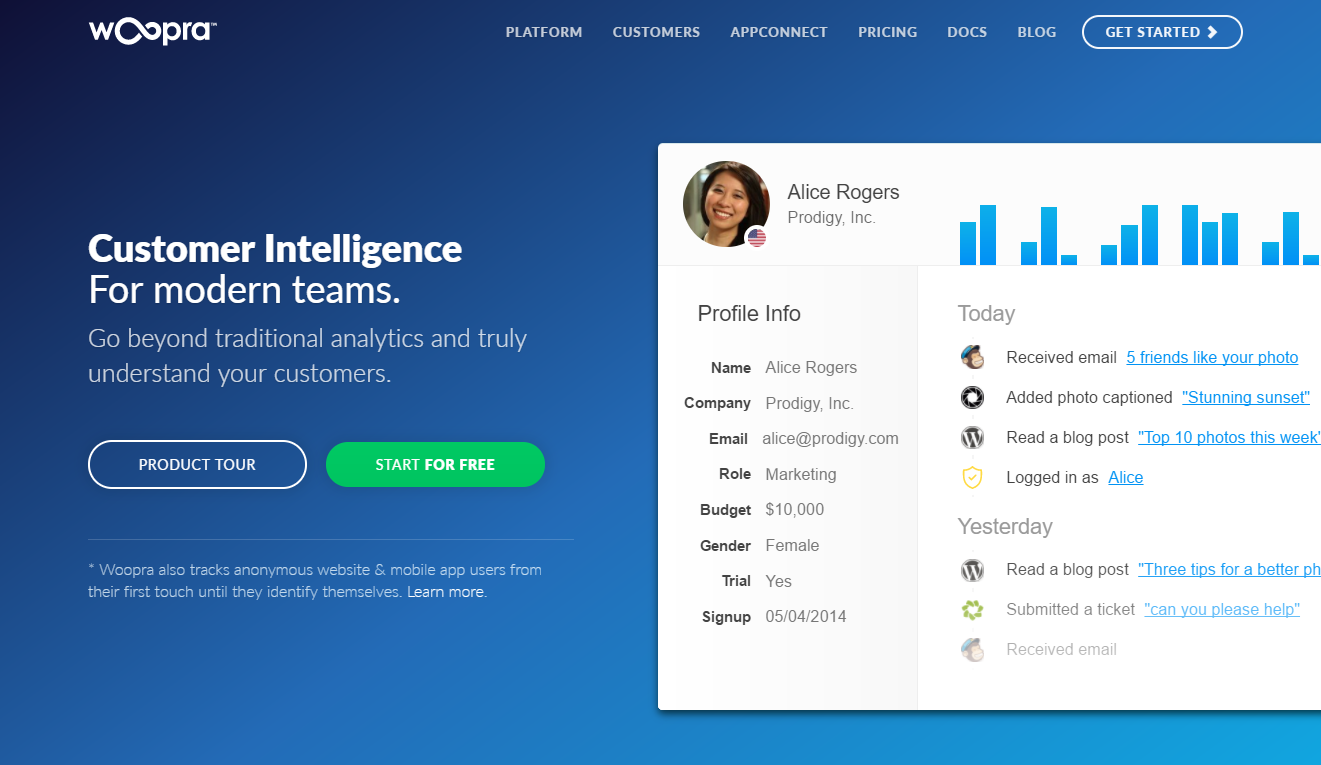
Visitors who are not certain about a product are invited to take a “Product Tour” – brilliant!
Another way to present complimentary CTAs is by providing exact same product in two different versions (free and paid or trial and full service).

Primary CTA “Get Spotify Free” is more visible and aimed at all website visitors. Especially those visitors who have not tried Spotify service yet. While secondary “Get Spotify Premium” carries less visual weight and is more likely to be oriented to those visitors who have already tried free service and would consider upgrading their account to premium. Secondary CTA can also be more appealing to prospects who are simply not interested in trial service and want to get full service immediately.
4.3 Contrasting calls-to-action
Contrasting primary and secondary calls-to-action are those buttons that have a distinctive difference in the outcome that follows after clicking them. One is likely to be associated with positive outcome while the other – with negative. Such CTA buttons are commonly seen on various types of forms or commercial overlays.
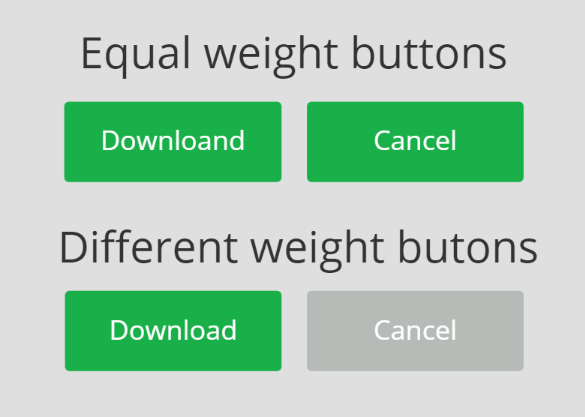
Primary action is the most important action as it enables conversion completion. Depending on your conversion goal, primary call-to-action buttons can be: “Get Free Trial”, “Submit”, “Download”.
In contrast, secondary CTA button is an alternative, less important action offered to the prospect. It can cause negative consequences when used accidentally. Therefore, visual presentation of secondary CTA should be well thought through.
The chances are that by presenting buttons with equal visual weight, you will not only confuse your visitors but also increase a chance of negative outcome. Reducing the visual dominance of the secondary CTA minimizes the risk of potential accidental click. Let’s take to the practice by analyzing a couple of examples.
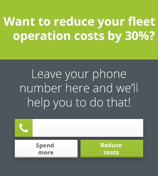
Is it immediately clear what you should click, in order to get the cost of fleet operation reduced (example on the left)? Not really. You have to read headline and sub-headline to understand the offer and then take another moment to distinguish which of the button is more appealing to you.
Ideally, the prospect should immediately know which button to click the moment he makes his mind to proceed with the offer (or not).
In this case, both CTA buttons stand out and create unnecessary obstacles for the prospect to immediately engage with the offer.
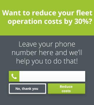
By making minor changes to the secondary call-to-action you can significantly improve the visual weight of the primary one (example on the right).
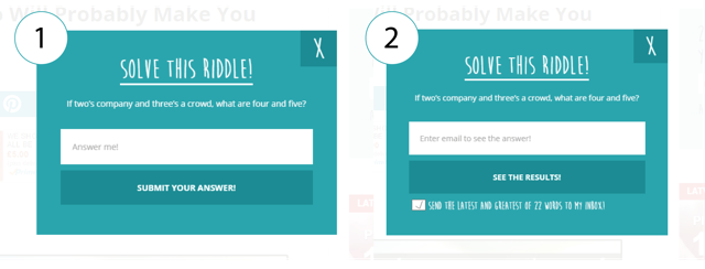
Another way to avoid accidental clicks on secondary call-to-action is not giving it a shape of a button. Take a look at the example below.

Primary action “Get Your Free Trial in 3 Minutes” is visually dominant. It also has a check mark (✓) which indicates positive action and outcome. Secondary CTA “I Want to Continue to Waste Time” is less visible and does not appear as a button. It is provided as an alternative option for the prospect, even if it associates with a negative outcome for the company.
Having primary and secondary calls-to-action on your website or overlays are not considered mandatory. Nevertheless, having such option can help you lead the prospect towards the ultimate outcome – desired conversion. It is important to choose wisely which action out of the two is more important as such decision will directly influence conversion rates. Match the visual presentation of your CTA buttons to their importance since the button with the stronger visual weight will get more attention.
With so many variables to take into consideration, creating high converting call-to-action can be more challenging than you could have thought. That’s why you should be observant and well aware of your audience and overall brand image. Finally, consider conducting an A/B test for your calls-to-action. Let your audience decide what is more appealing to their eyes and learn which design of your CTA has higher conversion potential.