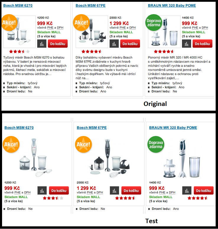
How do you know which design, message and CTA brings more leads? Without exit intent pop-up testing – you don’t.
Split testing is one of the oldest marketing or, more appropriately, decision-making tools in the world.
Imagine a pack of hunters-gatherers in the prehistoric world. One group of hunters go searching for a mammoth, the other one goes fishing. The method of the group that brought back most precious nutrients is considered superior and favourable.
Interestingly, split testing (also referred to as A/B testing or two-sample hypothesis testing) didn’t make its break until fairly recently.
In online marketing, the earliest case of split testing dates back to the turn of the millennium, when Google scientists performed tests to find the optimal amount of results to display on search pages. Nowadays, the technique is used by almost everyone to test pretty much anything. Exit intent pop-up split testing is not an exception.
[toc]

Preventing Exit with Exit Intent
The whole purpose of exit intent technology is to make your website visitors change their minds, scratching the decision to leave the page and signing up to your offer instead.
Split testing, on the other hand, works towards improving a selected goal weather it is growing newsletter signups, decreasing bounce rate or similar.
By tweaking your exit intent popup’s layout, color schemes, language style and call to action. You take the best from the both worlds.
In other words, split testing is your safety instructions, while exit intent technology is the safety net that prevents people from going south in case of a mishap.
Think of it the following way – if your website has a hideous color scheme, an exit-intent popup offering a discount on your product won’t keep your prospect from leaving. In this sense, the more split testing you perform to increase your conversions, the more focused your exit intent message can be.

In the perfect scenario, exit intent technology gives that last bit of value proposition your visitor might need.
Moreover, the idea is to use exit intent pop-up testing to seal the deal. You can offer a free e-book, a discount on a specific product, an invitation to a webinar or pretty much anything else that puts the cherry on the cake.
Pop-up Testing DOs & DONTs
So, the obvious question is, when exit intent ab testing can maximize the conversion rate and improve the effectiveness of exit intent technology.
The short answer is – everything.
The long answer is – it depends.
On the one hand, studies show that changing pretty much anything, even something like font size or the thickness of text outline can have a tremendous impact on the conversion rate.
On the other hand, split testing every little detail can chew up hours of your precious time providing very little benefit.
That’s why we’ll mention the most important aspects of your website you should test:
Calls to Action
Being the main driver behind your conversion rates, the CTA needs to be absolutely perfect.
Always remember the importance of testing only one aspect. Just so you can see exactly what difference the change made. Play around with the size of CTA, border color or text size.
Headline Copy
Headlines are one of the first triggers that grab attention. Changing a single word can have a great impact, and drastically improve the exit-intent click through rate.
Images
When looking for the balance between informative and emotional, changing the size and style of your imagery can prove invaluable.

Exit intent ab testing – cure for all your problems
If your website is not in its best shape, the bounce rate will be high and time spent on each page is low. In this case, the effects from exit intent technology will be hard to notice.
If your visitor wants to leave immediately after stumbling upon your site, a pop-up urging them to stay will not be the miracle cure for all your problems.
On the other hand, if the visitor has spent sufficient time on the page, gained basic understanding of what you have to offer and is even moderately interested. Then the exit intent pop-up can provide true value and pop-up testing can help even more to reduce the bounce rate.
To sum up, you cannot know what work unless you test. Make it part of your work routine – each month test a different aspect. See what works and keep testing. Pop-up testing can turn out to be the missing piece your exit-intent game was missing.
