A high bounce rate usually indicates that there might be something wrong with your website or communication strategy. You either aren’t attracting the right site visitor or the visitors coming don’t find what they are looking for. But is your bounce rate actually high? And if it is, what should you do about it?
But let’s start from the top.
What is a bounce rate?
A bounce is a single-page visitor on your website.
In Google Analytics, “a bounce is calculated specifically as a session that triggers only a single request to the Analytics server, such as when a user opens a single page on your site and then exits without triggering any other requests to the Analytics server during that session.”
To understand it better, let’s say the bounce rate of your website is 70%. That means that 70% of your all incoming visitors leave your website after viewing only one page. And the chances are, you’re not attracting the right visitors. Or the incoming visitors don’t have a good experience browsing your site.
How bad is a high bounce rate?
It depends on the type of website you have.
Simply put, a high bounce rate is bad if the success of your website depends on users viewing more than one page. Let’s say your homepage serves as a map to navigate your website (e.g. view product pages, access useful articles, create a user account). The biggest majority of incoming visitors view only that page and leave. In this case, high bounce rate indicates that website entrance page isn’t relevant to the visitors and you should most definitely do something about it.
On the other hand, if you have a single-page website like a blog or any other type of website that expects single-page sessions, then a high bounce rate is more or less normal.
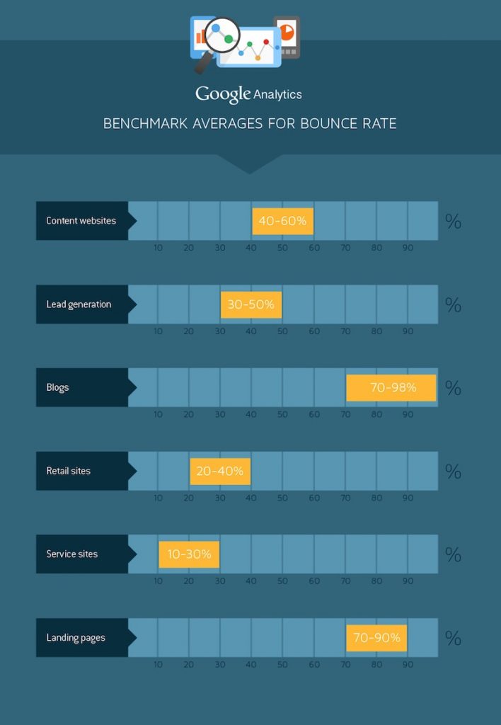
If you are still not confident about your bounce rate, compare it to benchmark averages.
 (Source)
How can you decrease bounce rate?
First of all, you need to learn which pages of your website tackle the interest of the visitor and direct him to other pages. Also it’s useful to know which pages are the first and last that visitor sees.
To do that, go to your Google Analytics page. Then hit Behavior > Site Content > All Pages. Carefully study which pages receive most views and what are their bounce rates.
You should pay a close attention to pages with both high volume of page views and high bounce rates. These should be the first pages you need to improve. Doing that can significantly reduce the bounce rate. Why? Because improved page with a high volume of traffic can direct more visitors to other pages of your website.
Now onto the actual work!
Attract the right visitors
If a particular page has a high bounce rate, take a look at your marketing campaigns that are meant to drive traffic to that page.
The chances are that users coming via those channels are bouncing because the ads or other marketing efforts are not relevant to the page content visitors are directed to.
What to do next? Improve your targeting. It can mean targeting different audiences, device users or giving more attention to different communication channels. And make sure you aren’t promising something you can’t deliver.
Improve website usability
Consider your website as the face of your company that forms the overall impression of your brand. If your website is constructed in a complicated manner, page load is slow and design is not functional, you might be pushing your visitors away. And it goes without saying, that poor website usability can significantly boost your bounce rates. And as we discussed already, it is something you don’t really want.
To improve the usability of your website, first, take a moment to understand your visitors. What are their goals and expectations as they come to your website?
First things first – website navigation. There really is no point of having an outstanding website, if your visitors are unable to use it and navigate around it to find all of the important information they are searching for. Keep it simple and obvious, assuring that your visitors are able to locate the necessary information fast.
Pay more attention to website design
Clear and concise website design is important no less. It’s not a surprise that the way your site looks can influence the decision of a visitor whether he wants to interact or do business with you in just a fraction of a second. One glance can turn someone into a customer, or force that person to click away.
But beauty is not enough! Your website design also has to be functional. Make sure your CTA buttons appear as clickable elements on your website. And don’t forget to carefully check if very image or section of the page has a purpose that is clear to the user.
If you have a content-based website, pay close attention to text readability. Make paragraphs shorter, use subheadings, bullet points, and bold keywords if necessary.
Consider using on-site retargeting tools
But be very careful. At this point, you should concentrate on directing your visitors to other pages, rather than rushing to convert them.
So what are the tools you should use?
Exit-intent technology allows to track user behavior on the site and detect the moment when a user is about to leave the site. In a split second, you can present him the most relevant offer on the overlay that would take him to another page on your website. Due to a variety of targeting options (URL, cookie, etc.), you can do almost effortlessly.
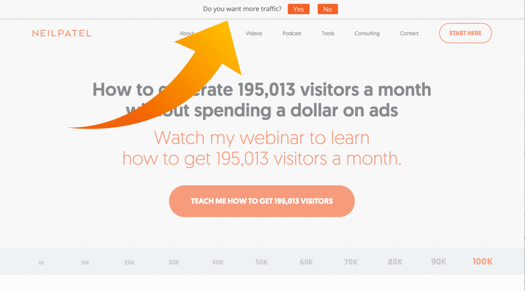
Promo bars can be helpful, too. Promo bar is a small bar that appears and sticks to the top or bottom of your website can be more effective than you might think. It is not intrusive. And if designed well – seamlessly blends into the overall design of your website without negatively impacting user experience.
If marketing guru Neil Patel is using promo bars to direct users to other pages of their website, it must be really working.

The key to running successful retargeting campaigns is presenting offers that are relevant to the incoming visitor.
Add links to related items or content
As you are working towards decreasing a bounce rate, you have to create more possibilities for the visitor to move across your website.
This can be done by adding links on different pages of your website to match your visitors with related items or content. As a matter of fact, in sales, matching customers with products or services of their interest is also known as cross-selling. These product recommendations are based on individual customer behavior on the site or common behavior patterns of other shoppers.
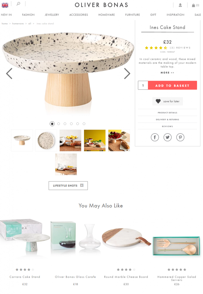
Oliver Bonas has “You May Also Like” section on almost every product page. It is used to present a similar type of items a visitor might be interested in.

The same can be applied to content driven websites, such as blogs. You should use sidebars and footers to add links to related or popular posts, as well as post categories.
As you are aiming to decrease the number of single-session visitors on your website, keep in mind that there’s no such thing as 0% bounce rate. And if Google Analytics says otherwise, most likely there is a tracking problem that is causing this artificial figure.
Of course, you should always strive for a lower number. And to achieve that, try different approaches and carefully evaluate what impact on results had every change you made.
