It will take a while to create purchase button that sells. It’s far from easy.
Internet users encounter numerous invitations to try different products and services on daily basis. By now they are more knowledgeable and not so easily approachable.
Finding right words to use in your purchase button can be challenging, but putting time and effort in it can dramatically increase your conversions.
So, here is how.
Back to basics
Call-to-action consists of a short and catchy message by which companies intend to capture attention of their prospects and make them take a certain action which eventually leads to conversion.
Different Purchase buttons bring different conversions. Depending on your business you can create numerous variations of it.
Here are some of the most common techniques used to create a conversion driven call-to-action
1. Define an action
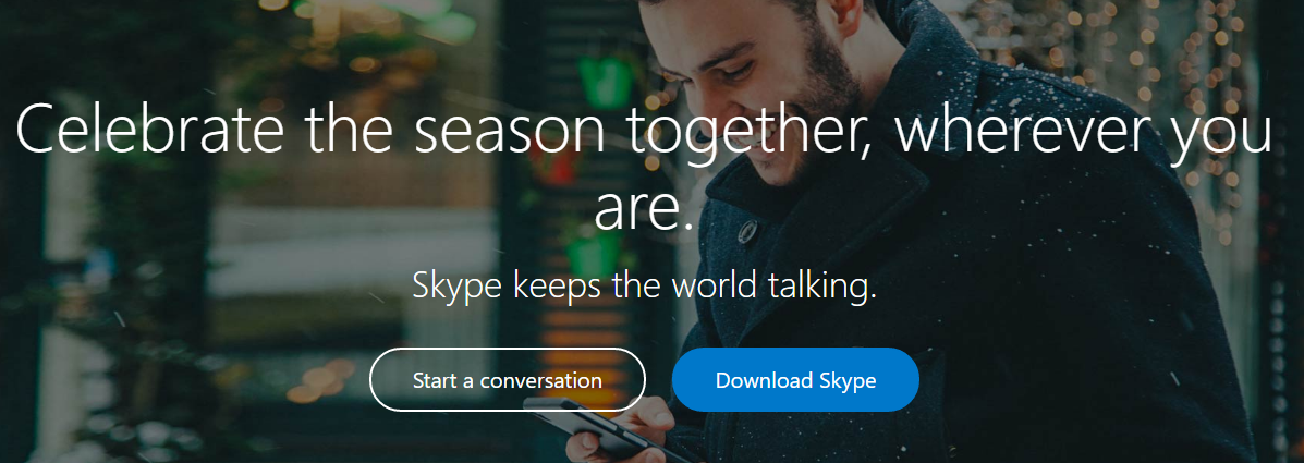
Call-to-Action is named like that for a reason. It is no surprise that every CTA starts with a verb. It suggest your prospects what should be their next step.
Probably the most popular words used in CTAs are:
→ Try
→ Get
→ Join
→ Download
→ Access
2. Imply exclusivity
People want to be superior to others, they want to own something others might not be able to own. Implying that certain items or services on your website are there for a limited amount of time makes many visitors believe they are the very few lucky ones who get to enjoy it before it leaves the market for good. Also, offering something exclusive usually makes a justice to the customers to pay the high price for it.
A few phrases that can help to emphasize the exclusivity of your goods or services:
→ Limited edition
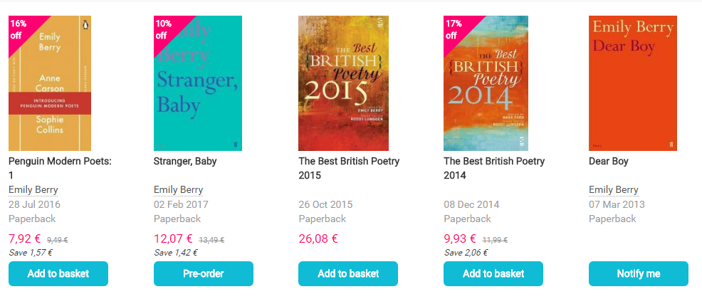
→ Pre-order
→ Members only
→ Premium access
→ Request invite
All of these phrases imply that only a certain type or number of people are eligible for the offer. In other words they are superior to others by having an opportunity to own something that is not widely available. Who wouldn’t want to be one of them?
3. Promote urgency
Have you ever put off your purchase to tomorrow and then completely forgotten about it the following day? Well, you are not the only one. The chances are your prospects are behaving the same way when browsing your website.
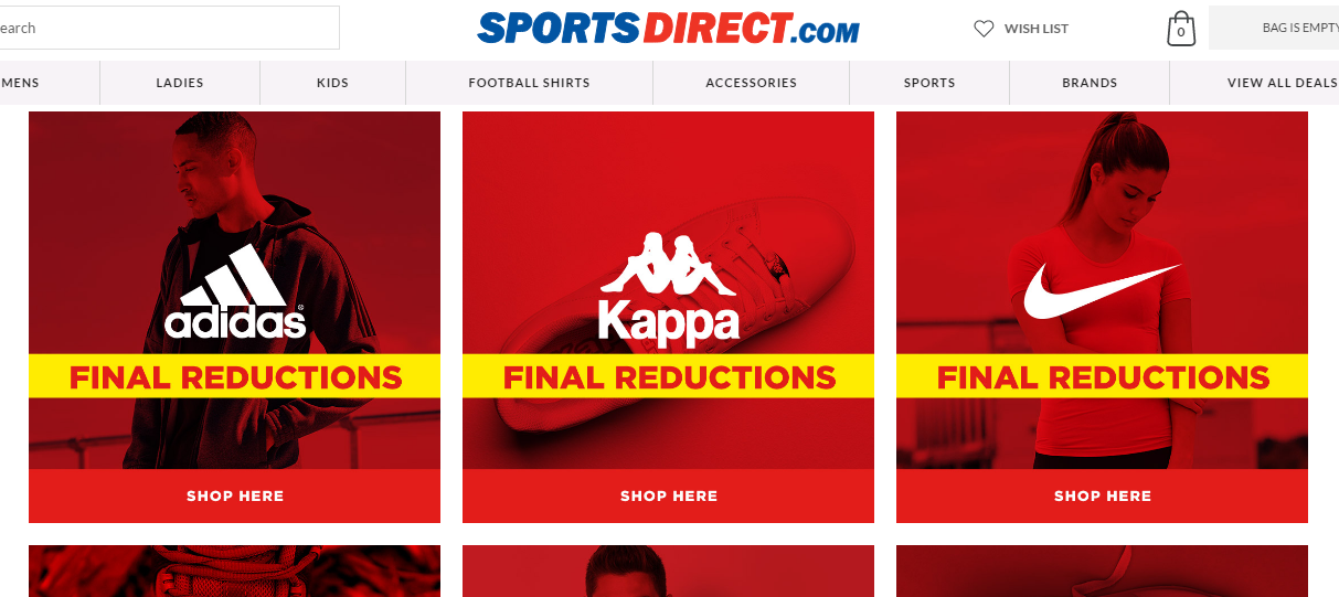
Create Purchase Button that Promotes urgency to make a purchase immediately. Almost 99% of window shoppers agree that time-bounded offers have a great impact on them when making a decision to purchase a good or service.
Words or phrases that could be used to create purchase button that encourages immediate action:
→ Today
→ Offer ends in…
→ Now only…
→ Last chance
→ Closing soon
Creating a sense of urgency motivates prospects to take an action at that very moment out of fear of missing out on a good deal.
4. Encourage conversation
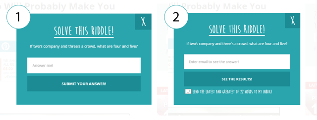
Companies should not underestimate the power of conversation. By encouraging your customers to leave a feedback, answer a certain question or submit one, you are building a closer relationship with your prospects. One way communication is an ancient practice that is not relevant in the age of social media.
The following are the most common words you can add to your purchase button to start a conversation with your prospects:
→ Reply
→ Submit
→ Request
→ Share
→ Comment
There are 2 more words that work wonders when used in Purchase button. First honorable mention goes to:
Personal pronouns help to create a closer connection to a product or service. According to recent studies first person pronouns, such as I and my, beat second person pronouns you and your by 24%. However, if you are not convinced by study results, run a quick A/B test and see which pronouns work better with your audience.
And then, of course, we have to mention:
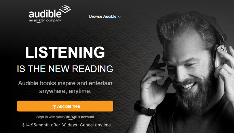
Emphasizing that certain goods or service are available for free (even if just for a limited amount of time) give prospects a better reason to engage with your company. It also gives you a better chance to convert your prospects into paying customers later on. You have to give in order to get.
How to Create Purchase Button Summarized
Every website should have call-to-action which suggests visitors a path to take to accomplish their objectives. By directing your prospects towards their next step, you make things easy for them, as well as get a chance yourself to convert them right from the start.
To summarize how to create purchase button that sells here are the main points:
[toc]
Moreover, if you want to learn more about how to design call-to-action this article is a must read.
