Companies often spend millions on customer acquisition but very little time and money on user experience optimization.
If your site has thousands of visitors but very few or no sales – this post is for you.
Here you will find the following:
- How to know if you need user experience optimization;
- Where to place your Call-to-Action to maximize conversions;
- All you need to know about micro and macro conversions;
-
Most effective email ideas to boost user experience;
- How UX can help to maximize CRO;
- The most Spectacular User Experience Killers.
Down bellow you can find The Table of Contents for easier navigation:
[toc]
1.0. Do you need user experience optimization?
It’s a valid question if you are wondering how to know if your business needs user experience optimization. And there is no one answer. You will need to look at your data.
The best free tool still is, and probably will be – Google Analytics.
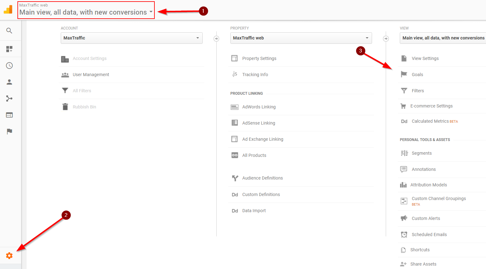
To start monitoring your conversion funnel data head over to Google Analytics -> select your property (1) -> click on the admin panel (2) and goals (3).
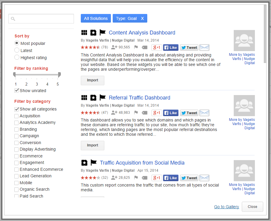
This is quite quick as you don’t have to create the funnel yourself but “Import from Gallery”![]()
Then you search for the industry you are in or for which tool you need the goals to set up and user experience monitoring can start.
Once the goals are imported, you can click on conversions (1) -> Goals (2) -> Funnel Visualization (3), and you will see if your conversion rates needs an improvement and in which parts of your site needs user experience optimization. 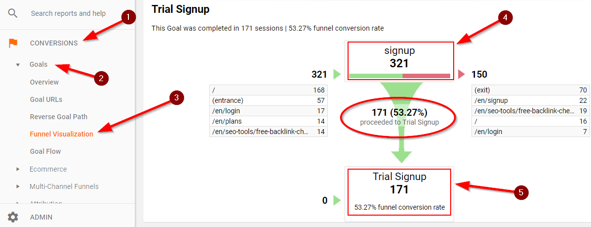
The only way to improve your business’s conversion rate is by A/B testing – monitoring the data and analyzing what it takes to improve the current state.
Average conversion rates in different industries stretch from 2% to 10 %. It is important to understand that these numbers can vary depending on the initial conversion goal. The chances are, your conversion rates will be higher if your goal is to collect contact information of the prospect in exchange for a free e-book. However, this number is likely to be significantly smaller if your goal is related to cash transactions.
2.0. Micro and Macro Conversions
All conversions are not created equally. Some simply matter more.
Depending on the goal, conversions can be divided into two main categories: micro and macro conversions. What is the difference between the two, you may ask.
2.1. What is micro conversion?
Micro conversion signifies a change in the user from being a prospect to becoming an active follower of your products or services.
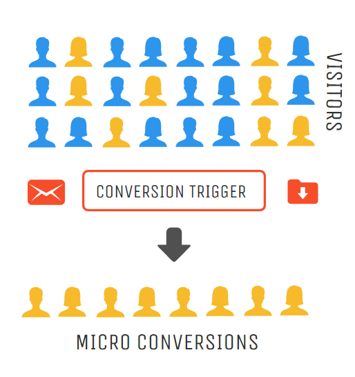
Micro conversions might include:
– Subscribing to newsletters, updates
– Downloading, sharing or engaging with content
– Uncompleted purchases or application.
Even though micro conversion is related to small engagements, monitoring them can help to discover important indicators of potential macro conversion.
By closely analyzing such engagements, business owners have a chance to learn more about user behavior and do user experience optimization accordingly. Usually, such changes are related to reducing obstacles site visitors encounter when trying to take some kind of action.
2.2. What is macro conversion?
Macro conversion is also known as a primary conversion because it aims to serve a primary purpose of the website.
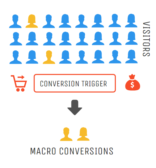
Depending on the industry your business is in, macro conversions might include:
– Completed purchases, applications or registration
– Upgrade to paid services
– Submitted forms
Macro conversion is an ultimate goal of all businesses.
However, it’s related to a high commitment on the part of the customer. Therefore as a goal, it is harder to achieve.
Solely focusing on macro conversion can put you in significant disadvantage for a couple of reasons:
- First, you are likely to give all of your attention to a small percentage of your visitors (macro conversions), and completely ignore the rest of the visitors.
- While possible micro conversions might just need a little time, a little nurturing to convert to paying customers.
- Also, you could be losing valuable information about user behavior on your site.
Such tools as Google Analytics allow you to gather data, which you can use later on, to improve your website to convert more of your visitors.
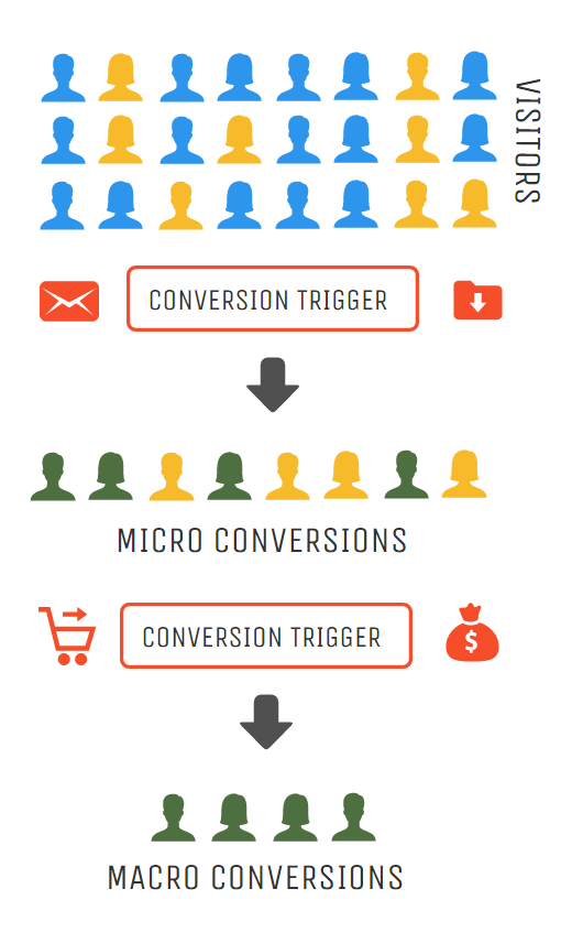
It is important to understand that not all micro conversions will lead to macro conversions.
Nevertheless, having micro and macro goals gives you a greater chance to see a multidimensional view of your website. As mentioned before, being able to see a bigger picture of your website is extremely important when growing and expanding your business.
3.0. How to Maximize Conversions with CTA
CTA in customer experience optimization often is the most important tool to get users from micro to macro conversions.
Moreover, Call-to-Action is one of the most important elements on your website, therefore it deserves extra attention.
If you pay a close attention to most of the websites, you will learn that call-to-action is usually placed either in the middle of the site or at the top right corner. Sometimes, as you will see in the examples below, CTA is placed both in the middle of the page, as well as the top of the page. And at times it is even visible in three different places.
Why?
Well, there are different approaches to CTA placement strategies. Each must be tested and data must be collected to see which placement has the biggest impact on user experience optimization.
Nevertheless, there are studies that show how CTA placement is highly dependent on complexity of the product or service offered. It means that CTA can be as effective when placed above the fold as placed below it.
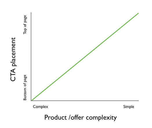
Let’s take a moment to unravel this statement.
3.1. Complex product or service
The more complex the service, the more information prospect needs to decide whether or not he or she is interested in it.
In this case, a page with the name of the product or service and the image of it will not do a justice for the visitor.
Let’s take a look at the email marketing service MailChimp.
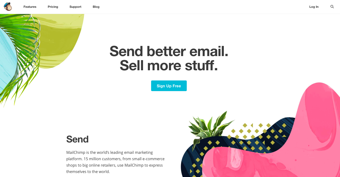
Once you open MailChimp homepage you immediately can notice their CTA – “Sign Up Free”.
The service offered could be interesting for various types of online businesses. This CTA is aimed at those prospects who have heard about MailChimp before and need a little to no convincing to try it.
Also, uncertain visitors are likely to look for more information about MailChimp service before they decide whether or not it is appealing to them.
As you scroll down the page, you get to learn more about the company and its service.
Call To Action appears at the very top and remains visible throughout the whole length of the page. This suggests that company is giving time to their prospects to get more familiar with their service. If at any point visitor makes his mind to try MailChimp, he can sign up for a free service at that very moment by clicking on CTA at the top right corner.
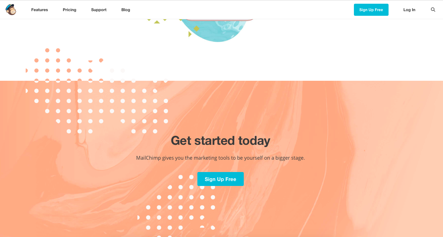
Finally, at the very bottom of the page visitor can see three calls-to-actions. A headline “Get started today” and two “Sign Up Free” buttons. Why three at a time? As a visitor has come to the very bottom of the page, it
A headline “Get started today” and two “Sign Up Free” buttons. Why three at a time? As a visitor has come to the very bottom of the page, it is likely to be the final point of interaction. It’s the last shot for the company to convert the visitor.
This is quite a common CTA placement strategy for companies that offer rather complex products.
3.2. Simple product or service
If your product is well known or is not as complex, prospects do not need additional information to make up their mind whether or not the product is interesting to them.
The chances are they are on your website for a reason – to start using your service or purchase a good. Take a look at the example below.

Firefox is a free open-source web browser.
It is also second most popular browser amongst internet users.
There is little to no information about the product on the homepage. And the most visible and inviting piece of information is the CTA button.
Finding a right place for call-to-action within your homepage is crucial, as it directly connected to potential conversion of your prospects.
Make it visible and easy accessible.
3.3. A/B testing
If it is difficult to decide which CTA placement strategy is the most suitable for your product and audience – run A/B test to it find out. In this case it’s true that if you don’t have data to support your statement – you are wrong.
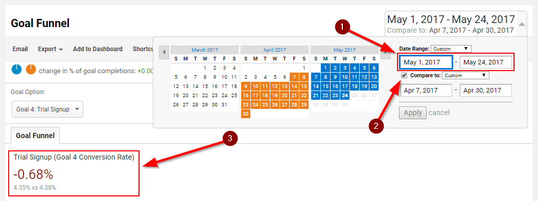
Once you have the goals set-up in Google Analytics and once again you go to “Funnel Visualization”, then select the period from/to (1) which the updated CTA has been running and click on “Compare to”. GA automatically will select identical period. That will show you the change in conversion rate (3).
In this example the changes we made in the past month has decreased the conversion rate by 0.68%.
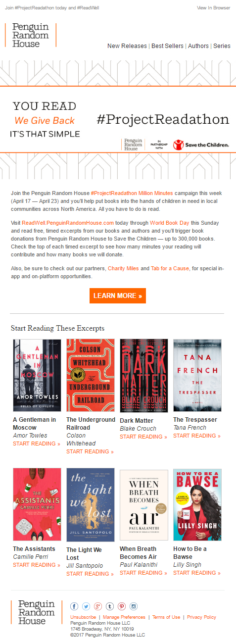
4.0. Effective email ideas to boost user experience
Building a mailing list can be tough, but making the most of its’ value is not that easy either.
Every subscription and sign up matter, as it can later result in sales increase. That is why you need to take your email marketing efforts seriously. Ensure you send emails that are worth not only recipient’s attention, but also time. If you are out of email ideas, you are in the right place to get inspired.
Moreover, once the user leaves your site, this is the channel where you place Call to Action. Once the customers bounce, emails become your best tool for user experience optimization.
4.1. Welcome new users or subscribers
Don’t forget to say hello to newly registered users or subscribers.
In the world of internet business, not sending a welcome email is considered bad manners. This is your chance to share your story and create emotional connection.

4.2. Confirm orders
Similarly to welcome emails, order confirmation emails are now considered mandatory. Once the customer places his order, he expects to receive a confirmation that proves his part is done.
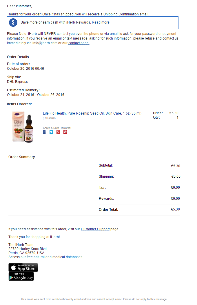
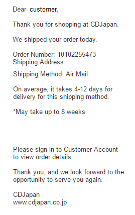
4.3. Inform about order status
Window shoppers can sometimes be very impatient. Keeping them well informed about their order status, will save you time from manually answering numerous inquiries.
- Let customers know when their parcel is shipped and what is the estimated date of its’ arrival.
- You can also introduce your customer to terms and conditions of your returns policy.
- Finally, leave useful links or email addresses customer can turn to in a moment of doubt.
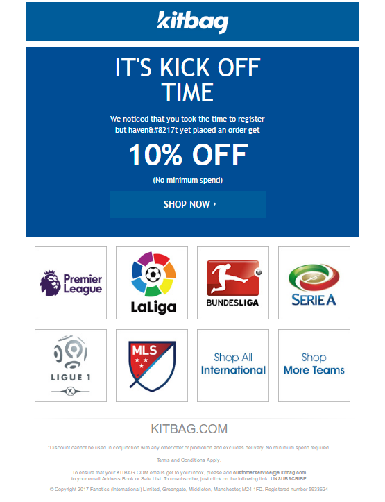
4.4. Encourage engagement
Just because visitor registered to your website doesn’t mean he will immediately become a paying customer. Keep inactive users on your radar and give them direction what their next move should be.
This is one of the best methods in user experience optimization.
4.5. Ask for a review
Reviewed products tend to receive more attention from window shoppers as these products are associated with real experience with a brand.
Moreover, +10 reviews can sometimes add +1% to your conversion rate.
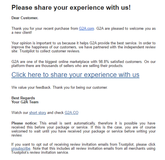
Within 2-3 weeks after purchase, send an email to your customer asking to evaluate his experience with the brand.
Usually, companies are asking their clients to review their product, but asking to evaluate customer service, product packaging or shipping, is as common and converts even better.
4.6. Reduce cart abandonment
Cart abandonment is a great deal of worry for almost every e-commerce store.
According to numerous case studies, average online shopping cart abandonment rate is almost 68%. Roughly speaking, that makes 7 out of 10 window shoppers leave the site without completing the purchase.
What a great loss of potential orders that could lead to increased revenue!
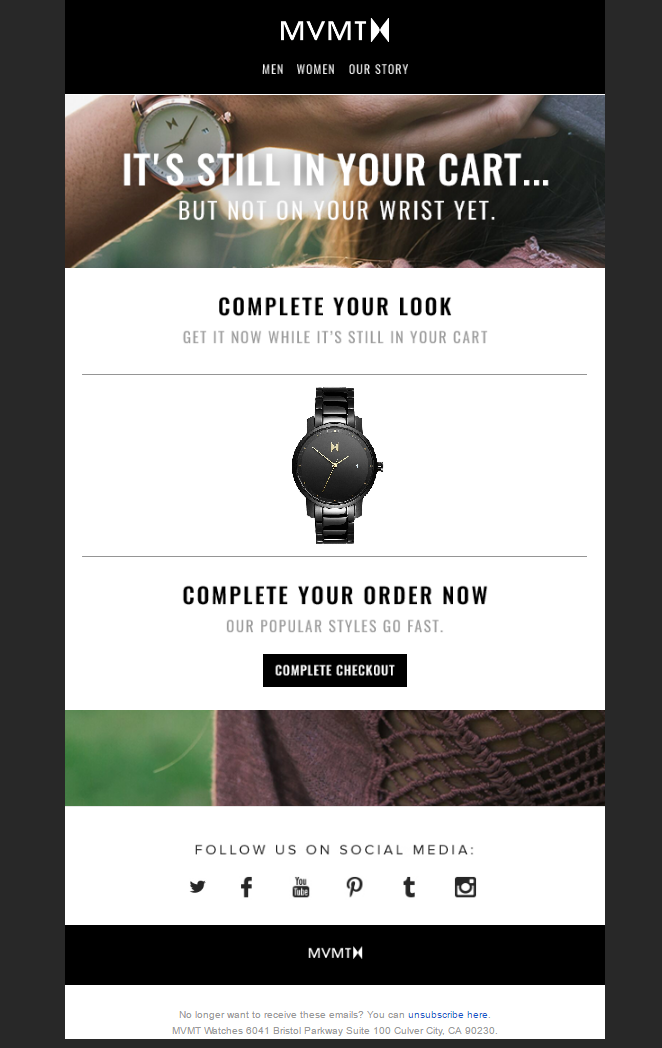
Remind your customers about carts they have abandoned.
A friendly nudge will do no harm, especially if it is carefully personalized.
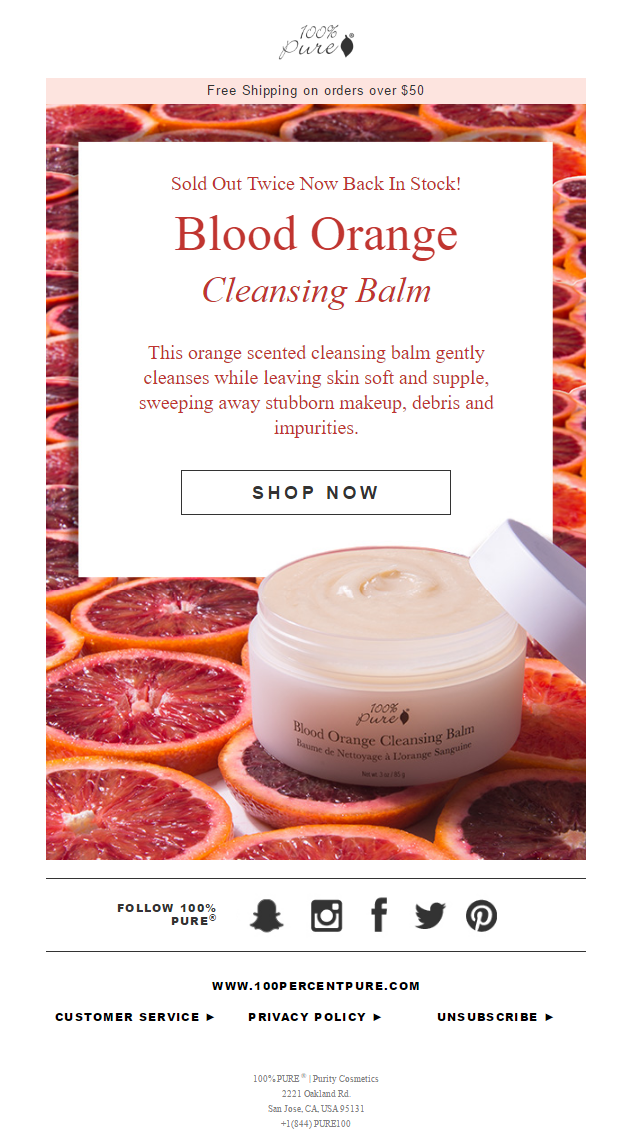
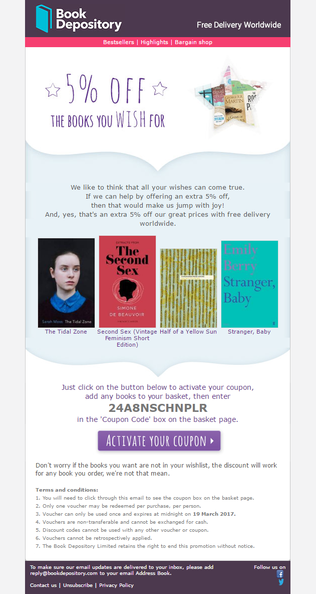
4.7. Send special offers that are engaging
Let it be discounts on product category, seasonal sale or holiday special, keep your customers informed about the deals they could benefit from.
This approach to sales is as old as time but is still relevant to this day.
Just add a modern twist to it – carefully follow current events that your audience is deeply engaged to. Once something comes up, react fast! Beware, real-time marketing can be your best friend and biggest enemy too.
Understand your audience to present the offers in the most appealing way.
4.8. Upsell using product recommendations
70% of window shoppers admit they would appreciate more personalized shopping experience. Keep that in mind the next time you want to send generic offers to your prospect or customer.
Create personalized product recommendations based on customers’ purchase history or visited pages and then deliver them to their inboxes. Doing this not only increases your chances to upsell, but also creates an image of a brand that knows their customers and cares for them.
4.9. Build a relationship
Social media has significantly changed the communication between the brands and customers.
Now, more than ever before, customers are willing to communicate with companies directly, let it be commenting under posts, submitting a question or joining the conversation.
Businesses that manage to maintain two-way communication are able to gain loyalty of their customers which also usually results in increased revenue.
Occasionally encourage your customers to share their experiences with the brand using social media and unique hashtags:
- Invite them to share pictures of the products they have purchased from your store.
- If you have any special events or projects going on, make sure your audience can find easy ways to take part in it.
4.10. Back In Stock alert
Most e-commerce stores allow website visitors to request updates on items that are out of stock.
Notifying window shoppers about items they are interested in can significantly increase customer retention. A simple email like this has a great conversion potential, as it is expected and personalized.
Customer submits his contact information willingly, expecting to hear from the store about a certain item he is interested in.
You can even go step further and install an extension called Follow Price. It allows visitors to set the price that they would be ready pay for your product and once certain amount of people would be willing to pay a certain amount – you can email these buyers and sell the item in bulk.
4.11. Discounts on Wishlist items
If your website has “Save for later” or “Add to wishlist” buttons for customers to add items they are interested in but not ready to pay for it yet, consider sending updates about these items regularly.
Whenever you have an ongoing offer that applies to these goods, let customers know about it. The probability that they will return to your site is high, as these shoppers have already shown their interest in a particular product.
Always keep your emails informative, playful and well personalized.
Most importantly – remember that every customer is in a different stage of his buyer’s journey, therefore different approaches must be used to present offers in the most relevant way.
5.0. How user experience can help conversion rate
The primary goal for majority of websites is to move visitors down the funnel:
- Whether that be signing up for the email newsletter,
- Purchasing a product,
- Up-selling/cross-selling,
- Or subscribing to members only club.
Most websites are designed with a desired action in mind.
That is where UX comes in. User experience, is incredibly important to ensure smooth navigation through a website.
In order to get to the point of conversion, the user needs to have easily navigated to that particular point. Poor usability or design can easily result in the user leaving the site without even noticing the points that encourage some sort of action. Hence user experience optimization.
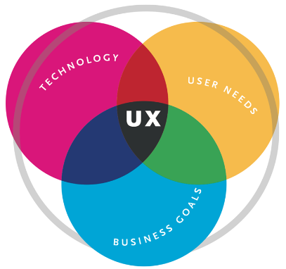
5.1. The Yellow Brick Road to Conversions
The objective of both a UX design service and a conversion rate optimizer is to get the customer to convert in the easiest way possible. They are both an aspect of this yellow brick road to the emerald city of conversions.
A UX designer wants to ensure the user has a seamless and effortless journey through the website. Essentially the UX is the road that is bright and easy to follow, a smooth path without potholes or dents.
The below graphic does a great job showing how the combination of technology, user needs and business goals make up the UX design.
This smooth path is built by extensive user experience optimization. It undergoes various forms of prototyping, interviews, focus groups, surveys, and a/b testing to ensure the optimal site is developed; a site that does not hinder the user’s ability to convert.
Keeping with the analogy of the yellow brick road, a user experience optimization would include signs and maps to help guide the user to the emerald city.
On a website, these conversion rate optimizers can include utilizing push notifications, assisting the user with chat boxes, or effective use of CTA’s.
5.2. How user experience can improve conversion rate
The three ways that user experience greatly improves the conversion rate of the site is by knowing the user, optimizing the converting features to be less annoying, and providing superior design.
Understand the user
Since a large portion of the UX process is spent discovering, researching and testing, there is a great deal of data about the user that emerges. It is this information that is extremely valuable to use in order to optimize the user experience.
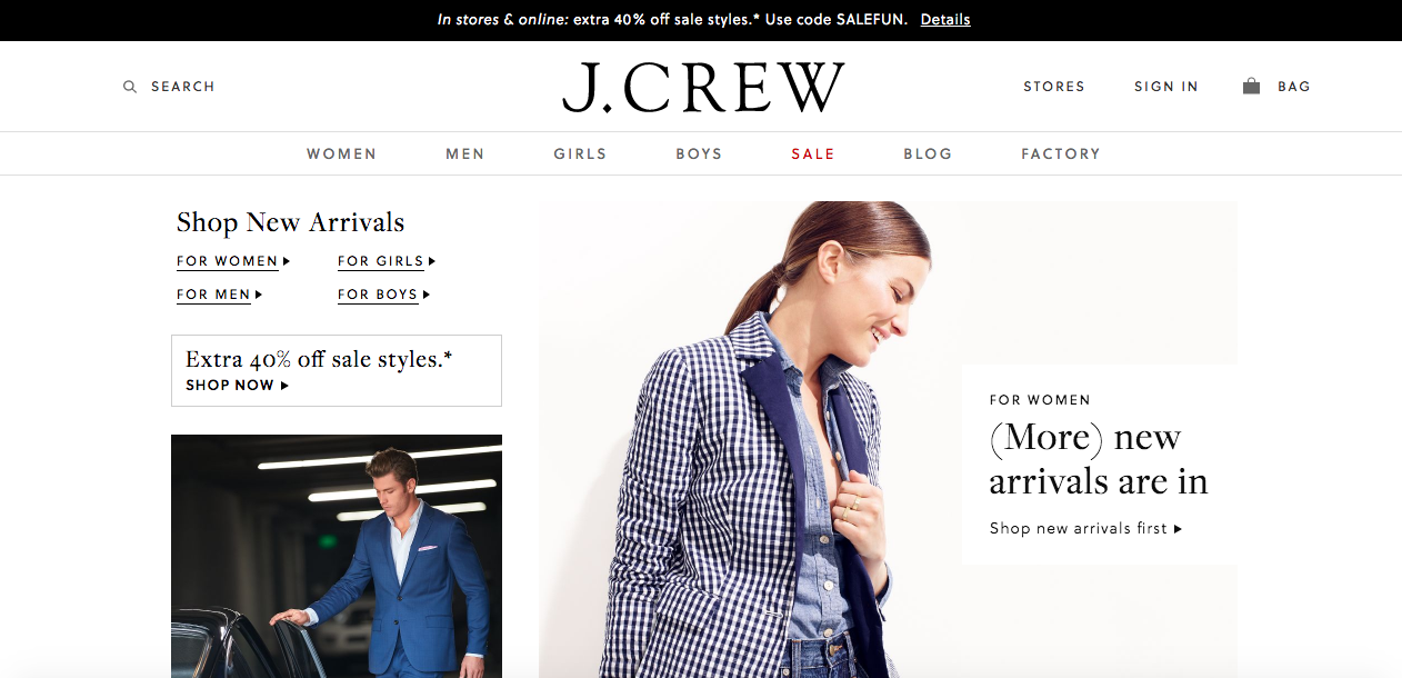
For example, it is found that 85% of users are only getting a third of the way down a specific page before that number drops to 22%. It means that website can be designed in a way that the call to action is near the top of the page, rather than towards the bottom like it may traditionally be placed.
Check how J.Crew site incorporates a number of different CTA’s before the user has to scroll down the page.
Make converting easier for the user
Getting the user to the page of conversions is only the first step of the process. It is critical to make sure the user actually completes the conversion and to do so is through optimal UX.
One example is filling out a form or payment information. This process tends to be traditionally long and tedious and sometimes leads to frustrations if not designed correctly. Improving the easy of use, such as having auto fill boxes, will help the user is following through with the conversion.
Have superior design across devices
Gone are the days that a website is all you needed to establish an online presence.
With the growth of mobile, especially on e-commerce platforms, users are choosing to shop through their mobile device.
If you don’t have a mobile friendly website, you can kiss a lot of those potential conversions goodbye. If you don’t have a website that is mobile friendly, hiring a mobile app development agency that knows the importance of user experience optimization is the way to go.
6.0. The most Spectacular User Experience Killers.
The majority of e-commerce sites state that conversion rate is the most important metric of them all.
So, imagine if you would know “what” kills it.

6.1. Failing to Prioritize
The most prominent conversion killer can be website design.
It is not just coloring schemes, chosen fonts and shapes that matter – it is crucially important to pay attention to how understandable the site is. Failing to prioritize and giving each aspect of your website the same level of importance can just push your potential customer across the threshold of a complete misunderstanding.
4 website design priority setting strategies that will help you avoid that are listed below.
6.2. Ranking Website Elements
Firstly, you have to make a clear distinction to which element of your page you want to lead your potential customer. In most cases, this could be CTA.
The easiest way to cope with that is to prioritize sections by ‘numeric value’ of every panel, ranking them by their importance.
6.3. Looking at It in Black and White
It’s also a great strategy to look at your page in ‘greyscale’ to see which elements stand out when everything’s in black & white.
By seeing the contrast of various items, you can clearly judge whether most important elements truly stand out. This way, pinpointing and fixing a lot of design problems becomes incredibly easy.
6.4. The Eisenberg’s Battleship
Another method is the Eisenberg’s Battleship approach.
Divide your site in a 10×10 grid and see in which grids the most important elements turn up.
Then, you can position your content to match a user eye movement pattern, thus giving your visitor clear visual cues on how to behave and convert.
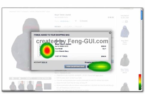
6.5. Visual Heatmaps
A common tool for website review is a visual heat map. Heatmaps precise users’ behavior on your website helping to distinguish what draws their attention. Let’s look at an example.
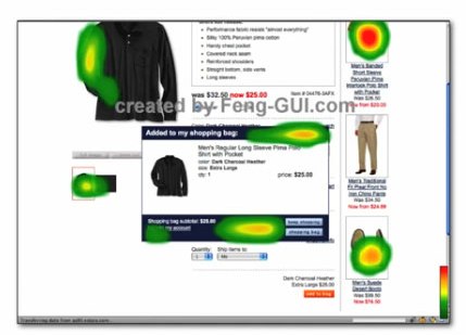
In this case, the heat map indicates a significant problem. The check-out process is the last step of closing a deal. However, in the picture above you can observe that the average customer is focused on everything else BUT the checkout window.
Even if the customer would intend to keep on with shopping, the design does not put the customer’s focus on the one thing that matters the most – conversion.
See how a simple overlay solution deals with the problem.
6.6. Being “Too” Innovative
“Out of the box” thinking is a MUST if considering any 21st centuries entrepreneur, however, sometimes ‘too much’ can be too much.
A decade ago when e-commerce was still rather undigested, Xerox researchers coined a term ‘information scent’ – a predator relies on his senses to find prey; a customer similarly follows visual and informational cues as long as he expects to get new information or make a purchase. However, if he comes across something that lead him into contradiction, that could subconsciously put him off.
Your site definitely should stand out and have its OWN flair.
However, you should estimate the importance of the expectations people hold for your online store.
Think twice before putting your navigation bar on the right-hand side, or putting the CTA button on top of the fill-in form, instead of the bottom!
The struggle your visitor might feel when intuitively looking for an element where they expect it to be can result in failed conversion.
6.7. Having Too Many Clicks
Doesn’t make sense at the first glimpse? I’ll explain.
The conversion rate is determined by dividing the total amount of clicks by the number of conversions. If you decrease the number of clicks, while keeping the conversions constant, you end up with a higher conversion rate. As simple as that!
An extreme example of this is the Nigerian prince scams. The bait letters are intentionally obnoxiously written so that only gullible people reply. This way the scammers only have to reply to only several hundreds of mails a day to people who already have a slight chance of falling for it.
In a more convenient situation, the equivalent would be bogus traffic, which brings the conversion rate down.
If you’ve tweaked your design to the maximum, and you’re absolutely positive that your website design isn’t the cause of low conversion rate, then perhaps you’re just not approaching the right target audience. That’s the equivalent of selling smartphones in a candy shop –it’s just not what people came here for
The conclusion? Make it simple! Keep it fresh, but predictable!
Ready to start user experience optimization?
Once again to sum-up, these were the topics that this article covered:
- 1.0. Do you need user experience optimization?
- 2.0. Micro and Macro Conversions
- 3.0. How to Maximize Conversions with CTA
- 4.0. Effective email ideas to boost user experience
- 4.1. Welcome new users or subscribers
- 4.2. Confirm orders
- 4.3. Inform about order status
- 4.4. Encourage engagement
- 4.5. Ask for a review
- 4.6. Reduce cart abandonment
- 4.7. Send special offers that are engaging
- 4.8. Upsell using product recommendations
- 4.9. Build a relationship
- 4.10. Back In Stock alert
- 4.11. Discounts on Wishlist items
- 5.0. How user experience can help conversion rate
- 6.0. The most Spectacular User Experience Killers.
Once you decide that it’s time to give user experience optimization a go – make sure you have analytics set and ready to collect the necessary data.