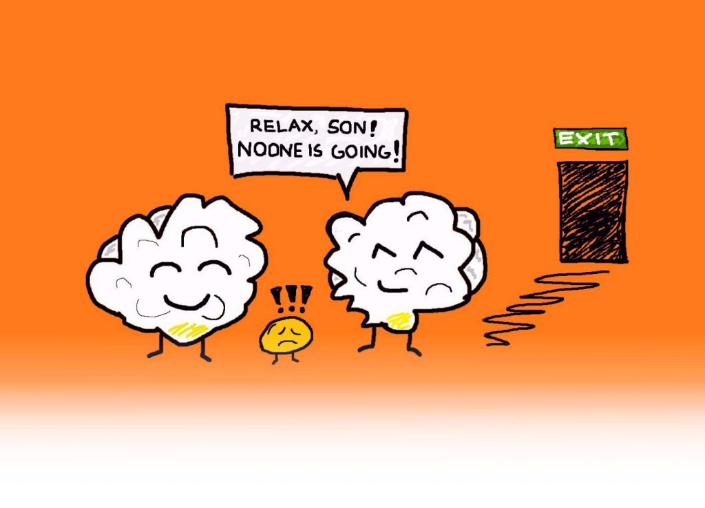
Wait! Are you really willing to pop that cute little corn fella’s head?
Thank god! Not always, though, can websites rely on their readers’ conscience to make ‘em stick around. Instead of making people feel Popcorn Guilt, we recommend something else we like to call Popup Pleasure. Popup pleasure, you say? Precisely. We are talking about the joy one gets from receiving an awesome discount or some other sweet bonus from an Exit Intent Popup.
“C’mon, popups don’t bring anyone pleasure,” you may burst out. That might well be so. But Exit Intent Popups do have a significant effect on website visitors’ behavior. We have been around with MaxTraffic ever since the Exit Intent Technology started blooming. And, looking at the results of hundreds of our clients, it is hard to ignore the power of this technology.
If you are thinking about creating an Exit Intent Popup for your website, our experience is bound to come in handy. More than 5 years in the field has taught us many hacks and tricks. We are happy to share some Examples and Pin-pointers with you. Let’s get poppin’, shall we?

EXIT INTENT POPUP THAT DRIVES SALES
1. Discount 2. Time-Based Offer 3. Free Shipping 4. Free Sample/Trial 5. Suggest Products 6. Items in Cart
EXIT INTENT POPUP THAT GENERATES LEADS & SIGNUPS
7. Social Media 8. Discount 9. Newsletter 10. New Content 11. A Chance to Win
USE EXIT INTENT POPUP TO IMPROVE CUSTOMER EXPERIENCE
12. Feedback 13. New Features
EXIT INTENT POPUP THAT DRIVES SALES
One of the most traditional reasons why many websites consider the idea of implementing Exit Intent Technology, is so they could increase their sales numbers. There are several different ways to give the customer a little “push” towards purchase.
1. Offer your visitors a Discount they cannot refuse
Target at: First-time visitors, paid traffic
Place on: Site-wide, landing pages, pricing or sign-up pages, product pages
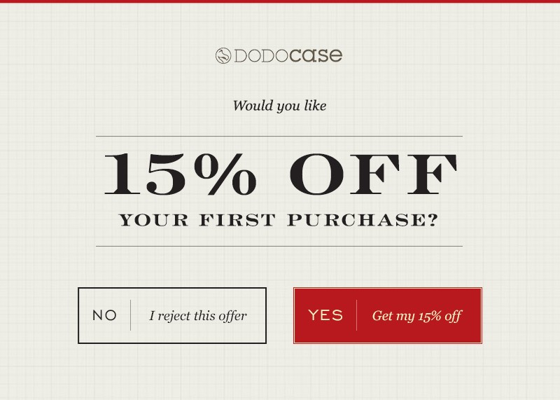
Perhaps the most common approach to lure customers into making a purchase, is to offer them a chance to save some money.
Depending on the product or service you are selling, you could offer a 10% discount:

Go a bit higher:
Pump it up even a bit more:
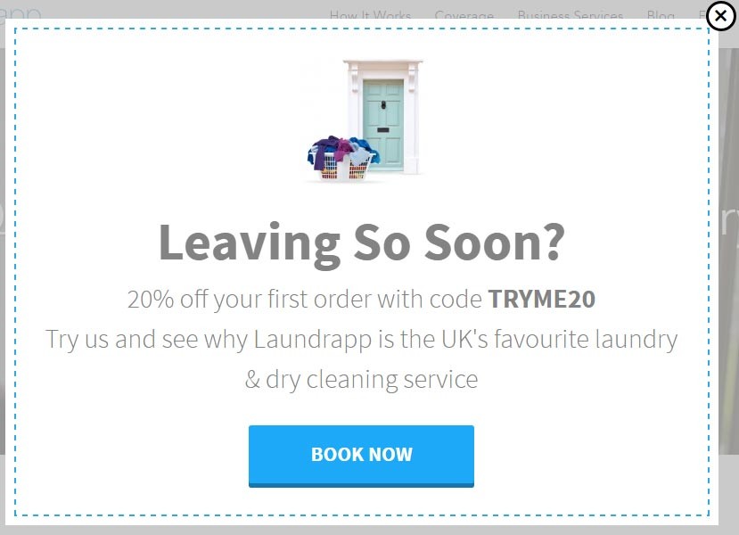
Or, why not, go nuts, and offer something like 83% off:
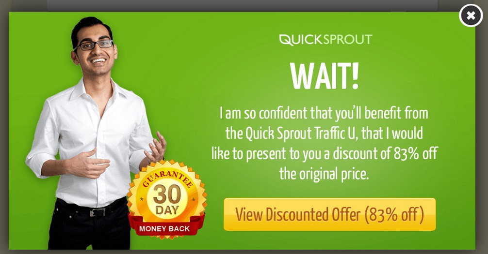
Of course, it is only realistic to offer such humongous discounts if you are selling a non-physical product like Quicksprout in the given example.
Occasionally, though, instead of offering a percentage off the original price, you might want to consider a discount that is worth a specific amount of money:
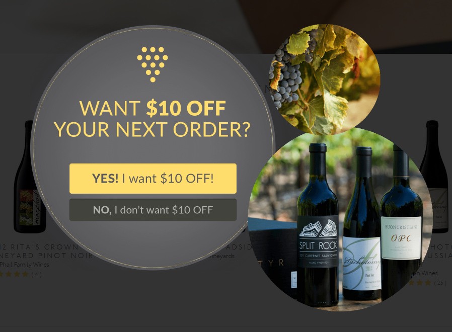
An easily relatable value often gives a more clear sensation of the gift. Let me illustrate this point.
Everyone has a rough idea what they could buy for 10$, right? You can go to a supermarket and buy a bag of snickerdoodles. Great. A lovely vendor is offering me a discount that’s worth a bag of sweets.
Let’s visualize another scenario. A person is looking to get his house’s chimney cleaned for the first time in god-knows-how-many years. He has no clue how much this kind of service costs. And suddenly, puppyeyedchimneysweepers.com throws an Exit Intent Popup at him, offering a 12% discount.
Probably most of you by this point would already be somewhere long gone, looking at cat videos on Facebook. But let’s say that this guy is very eager. He discovers that the price ranges from 150$ to 250$. He does the calculations (good for him, he knows some maths) and gets a rough idea. Approximately two bags of snickerdoodles. Now, couldn’t they just have started with that information?
Using this tactic can also save your business some money. Imagine for a moment that you are selling expensive products, just like Winestyr in the example above. 10% off on a 150$ product is worth 15$ for the business, while offering a cool 10$ discount might have the same, if not a better effect on the customer. That’s 5 bucks you just saved for changing one symbol in your Exit Intent Popup.
2. Add some pressure by making a Time-Based Offer

Target at: First-time visitors only
Place on: Landing pages, pricing or sign-up pages

It doesn’t come as a huge surprise that humans are easily manipulated. When put into certain situations, our minds can easily be deceived. Remember the time, when you actually believed there was a coin behind your ear?
Marketers are known to use the basics of human psychology to their advantage. In fact, there are a couple of tricks that may turn out to be tremendously successful when combining with an Exit Intent Popup.
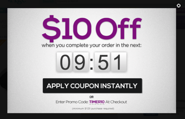
Have a look at this Exit Intent overlay:
Now, imagine the following scenario. After a hard day at work, you get home, order take-out, grab your laptop, and get all comfy on the living room sofa. After some time of browsing social media, you discover yourself on an e-commerce site. You see a product you like and immediately think about buying it. But then you realize that your wallet with all your credit cards is in the bedroom. What do you think – are you really inclined to lift your behind and go get it?
Well, sure, in some cases you might be. But chances are that the idea of getting up from that sofa does not sound all that appealing. You can always buy it later, can’t you? For an online store, later is a magical land filled with uncertainty. You might indeed buy it. But you also might reconsider, forget, find a better offer, get run over by a car, or a dozen other things could happen.
There must be a way to convince a customer to go get that wallet pronto. And there is.
Consider adding a 10-minute timer to your discount. Nothing makes us move faster than the fear of losing something valuable. In the example above, Babyage took perfect advantage of the human nature. Making a limited-time offer might be just enough to make us go get that wallet.
Adding a timer is not the only way to create a feeling of urgency:
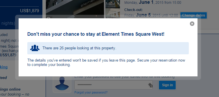
Even though there is no actual countdown, a person who is interested in a specific offer on Booking.com, can’t really feel comfortable to learn that 25 more people are also considering to book that same property.
Another way to mess with customers’ brains is to create a feeling of scarcity. Zulily executed this perfectly:

Think about a customer who is unsure if he is getting the best price available, or simply wants a day or two to think about things.
Properly motivated people could be willing to spend hours or even days online, just to find a better offer. The idea of going through all that effort seems a lot less appealing, though, once there is a potential danger of actually having to pay more in the end. Not to mention the possibility of being left with empty hands altogether, in case no other website actually even offers the product.
Exit Intent Popup can easily be used to let the website visitors know that you are running out of stock. This could be a crucial selling point in case it involves a specific product they have shown interest in.
3. No-one dislikes Free Shipping

Target at: Everyone
Place on: Shopping cart, pricing or sign-up pages
Arguably, free shipping is more of a necessity than a perk nowadays. Be that as it may, you could still make it appear like a sweet bonus. Check out this Exit Intent Popup:
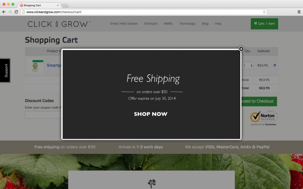
And here’s another one:
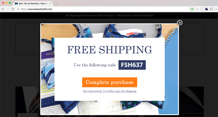
Can you notice something different in the following example, though?
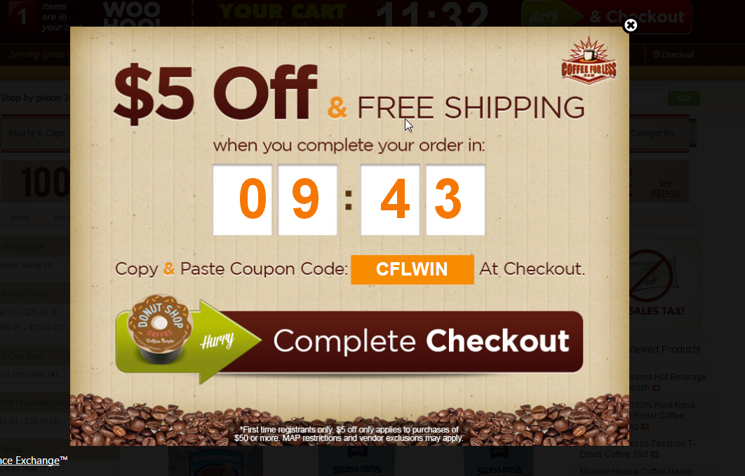
That’s right. Free shipping can be combined with a discount, a timer, or even both of them. CoffeeForLess did a great job at squeezing all these elements into one single ad.
4. Give people a taste with a Free Sample or a Trial Period

Target at: First-time visitors mainly
Place on: Landing pages, product pages, related products
Sometimes a simple discount or free shipping just ain’t gonna cut it. If you are sure your product or service is awesome, why not give the clients something to nibble on for free. After they get the taste of it, they might get hooked. Exit Intent Popup ads can very well be used to offer customers free samples:
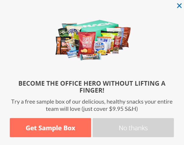
Expecting customers to cover only the shipping and handling costs, Snacknation offered people literally something to nibble on. Don’t worry, though, if your product is not edible. People also need other kinds of things. For example, teeth to nibble with:
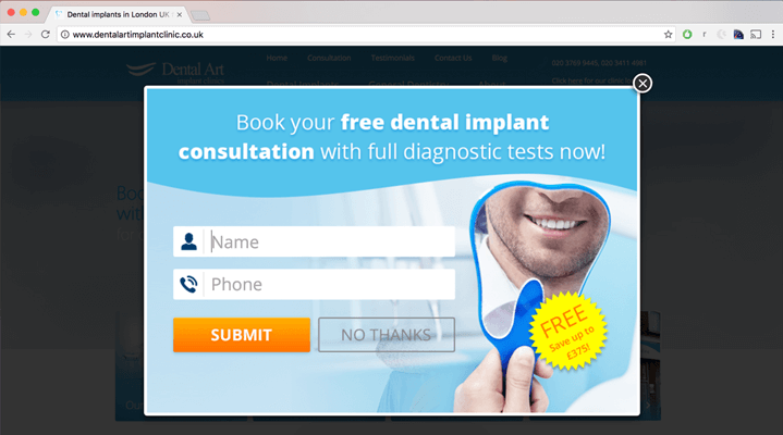
Dentalartimplantclinic took full advantage of the fact that people are not very fond of seeing a dentist. 
Giving away a free consultation is not that big of an expense, considering that most of the people that come in, do have issues with their teeth.
Going through the hassle of finding another dentist to actually fix the teeth afterwards, is not something most people would be eager to do. In fact, normally it’s the opposite. Reciprocity effect is likely to bring them back. That’s why many pubs offer you free peanuts or pretzels – so you would feel obliged to buy at least one more beer.
A taste can be given in the technological world as well. And I am not talking about robotic tongues:
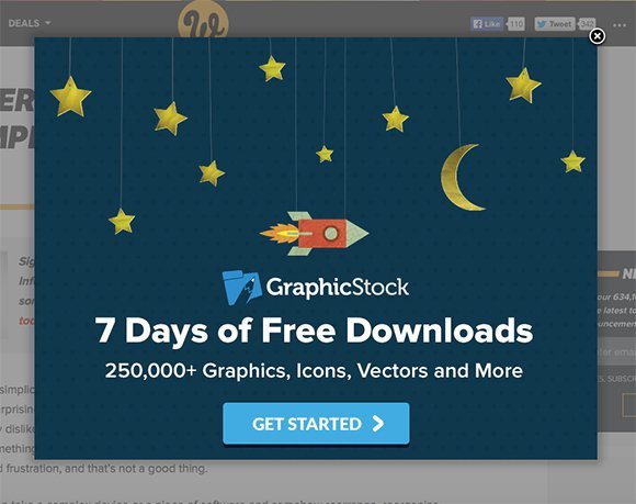
Whenever selling software or computer-related services, a free trial period is almost a must-have. Programs are often expensive, and as people are not willing to gamble – they tend to lose interest. That’s where an Exit Intent Popup should step in and offer a free trial period. Chances are, this will revive the customers’ interest. That’s exactly what Graphicstock had in mind in the example above.
5. Show the customer other Relevant Products

Target at: Returning visitors who did not make a previous purchase, first-time visitors
Place on: Site-wide, landing pages, product pages
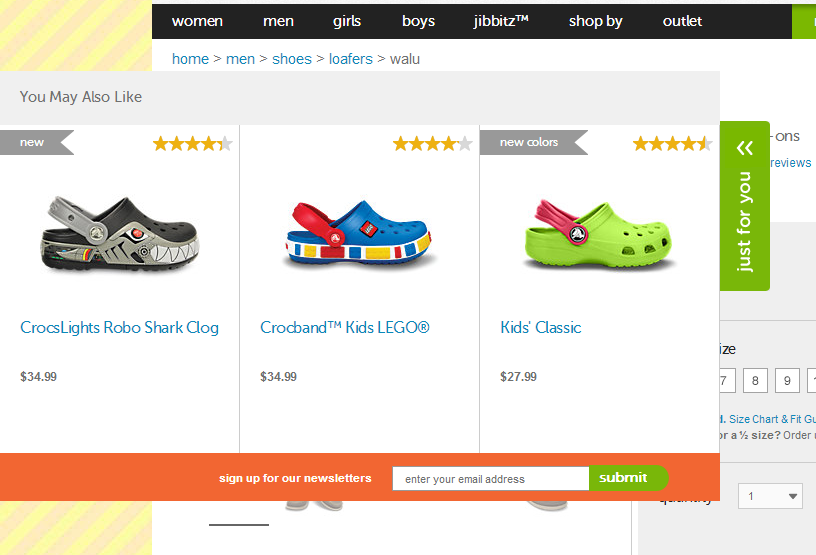
You have a new and exciting product. Can your customer find it on your online store? Of course, if the answer is NO, you might want to take a serious look at your website usability. But even if everything appears to be in order, you could still be interested in redirecting customers to relevant product pages. Needless to say, Exit Intent Technology provides a simple solution to this problem.
You can design your Exit Intent Popup to direct customers to the hot/trending products:
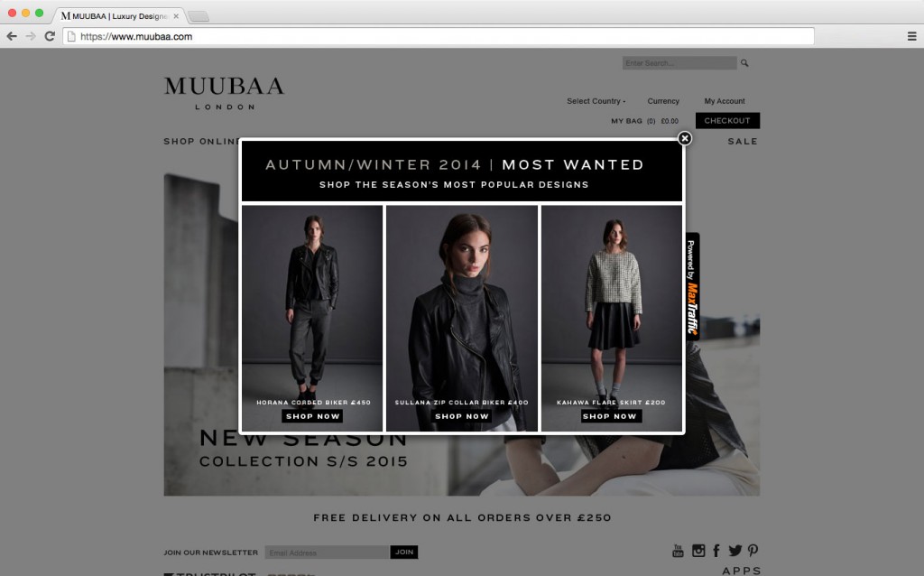
Interest them with something that’s come “fresh from the oven”:
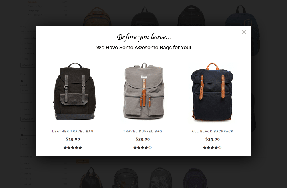
Or spook them with a picture of scary crocodiles, I mean, other related products:
Not only e-commerce sites can have products to recommend, though:
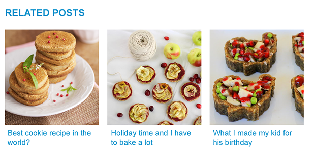
Sure, a blog post might not be a “product” – but the idea still remains.
Have you ever been looking for cooking ideas online? If yes, you probably agree that the first recipe you come across, rarely ends up being the chosen one. Either it might seem like too much trouble, or you might be missing some ingredients, or time, or even a proper kitchen device.
A person who has read through a recipe might very well be interested in related posts, aka other recipes the food blog has to offer. Why not help him find what he is looking for with the aid of an Exit Intent Popup?
6. Remind shopper about the Items in Cart

Target at: Site abandoners with products in cart; paid and organic traffic
Place on: Site-wide
Perhaps one of the most important segments you will ever want to target with your Exit Intent Popup, is the Cart Abandoners.
An astonishing 69% of all the online shopping carts end up being abandoned. 69! Yeah, I get it, you have a dirty mind as well. But that is more than 2/3 of the whole thing! Many of the customers might have been really close to making a purchase. And some of them can surely be persuaded to finish what they once started. Exit Intent Popups can and should be used to convince them:
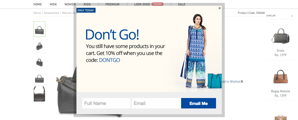
Offering cart abandoners a simple discount coupon is a classic approach. You could also take it a (bald) step further like MooseJaw, and go for an Exit Intent Popup like this:
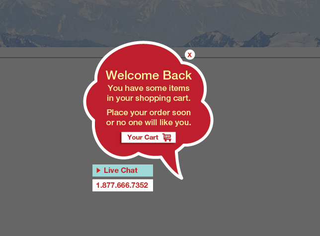
We can’t necessarily recommend threatening potential clients as an actual strategy, but then again – who are we to judge? If it works, then it works.
Instead of being the sneaky devil, you could also try to act like a cute little angel. How does offering a guest to take her coat differ much from this:
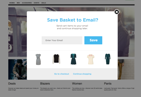
In either case, you seem like a good host and everyone ought to be happy.
EXIT INTENT POPUP THAT GENERATES
LEADS & SIGNUPS
Not everything you do as a business has to be, nor even should be about triggering immediate sales. In order to preserve a vital stream of customers onto your website, you need to actively generate leads and signups. Exit Intent Popup is a highly effective tool for getting people to sign up.
7. Make sure you are followed on Social Media

Target at: Repeat visitors, organic traffic
Place on: Content pages
They say if you are not on social media, you don’t exist. Mere existence, though, doesn’t get you too far. You also need followers. Fans. Subscribers. Friends. Family. Okay, maybe not family. But most of the aforementioned are still of critical importance. People must not only acknowledge your company’s existence, but also interact with you.
Now, finding all these folks is not necessarily the easiest of tasks. Fortunately, there are several ways to generate activity on your social media accounts with the help of Exit Intent Popups.
You could start by simply asking people to get to know you better:
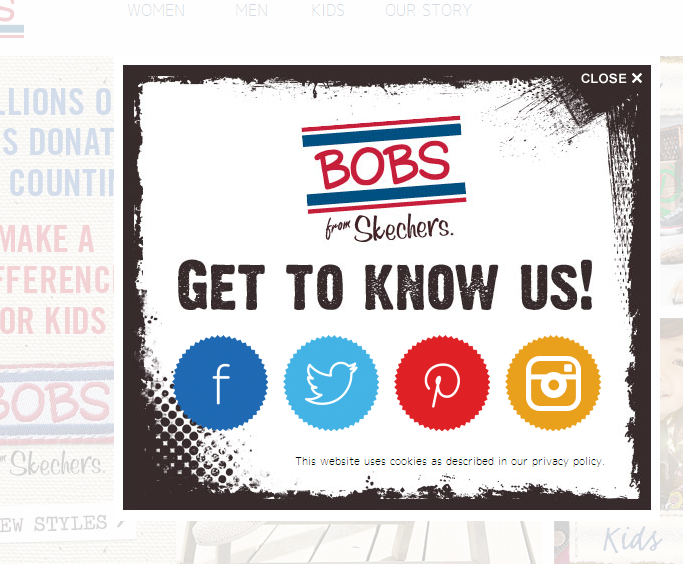
Skechers used this very good-looking popup to direct people onto their Facebook, Twitter, Pinterest and Instagram accounts.
You can focus on a medium that is more important for you, though:
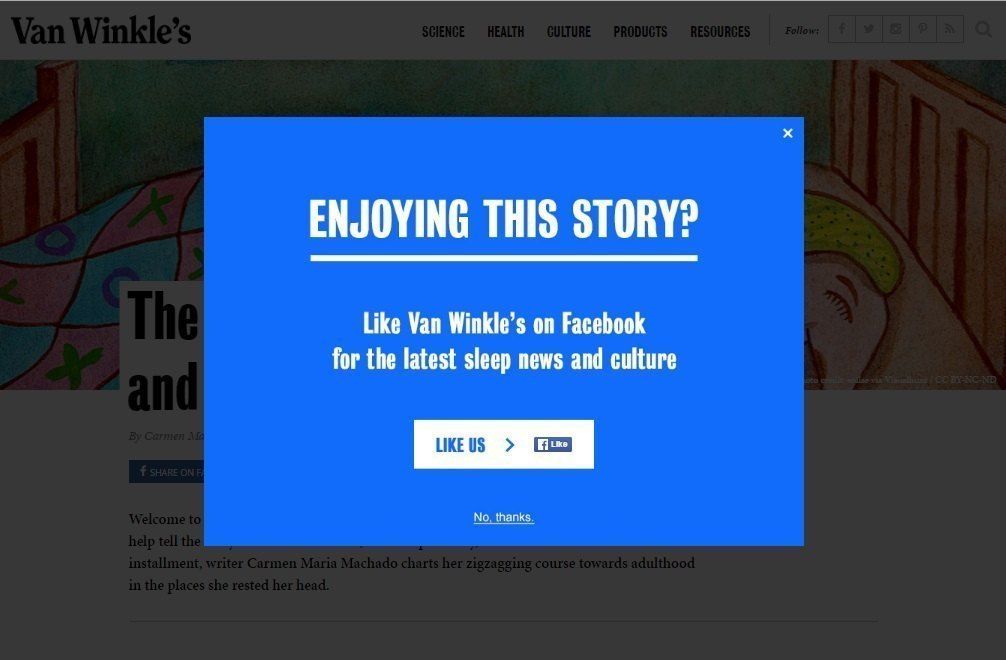
Some businesses do not have accounts on all different social media sites. Whatever the specific reason, Wan Winkle’s decided to put all their eggs into Facebook basket.
Both of these examples were simple, yet eloquent. Don’t worry, though. The complexity can be brought up a notch:
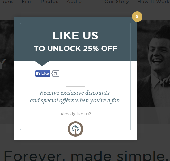
Very nifty, huh? This way you can boost both immediate sales, and generate leads for the future.
While social media is very important, usually when businesses talk about leads, they talk about email signups. Once again, Exit Intent Popup (Popman?) proudly steps in. This tool can be very effectively used to collect a numerous amount of emails. In fact, there’s a variety of ways how to do it.
8. Offer a Discount in exchange for an Email Signup

Target at: Everyone, emphasis on first time visitors, paid traffic
Place on: Product pages, pricing or sign-up pages
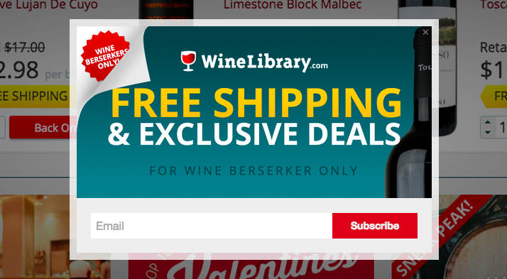
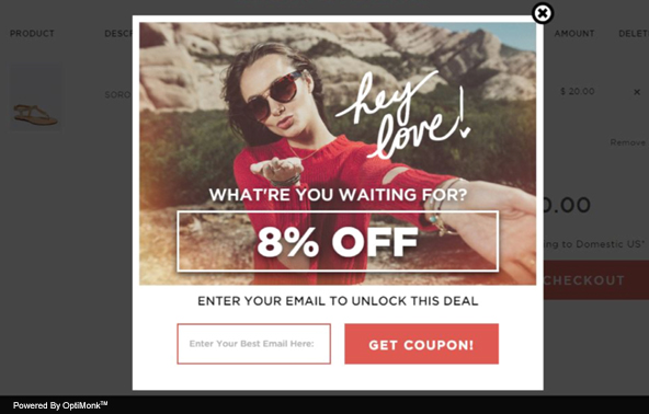
Offering a discount is perhaps the most common approach that companies use to get their fingers on a signup. In order to receive a discount coupon, a visitor needs to submit his (name and) email address. The business is guaranteed to get a lead, and the chances of making an immediate sale are also increased. Two birds with one stone, ay?
In terms of scope, the offers may, again, vary significantly. From free shipping:
To 8%:
To 20%:
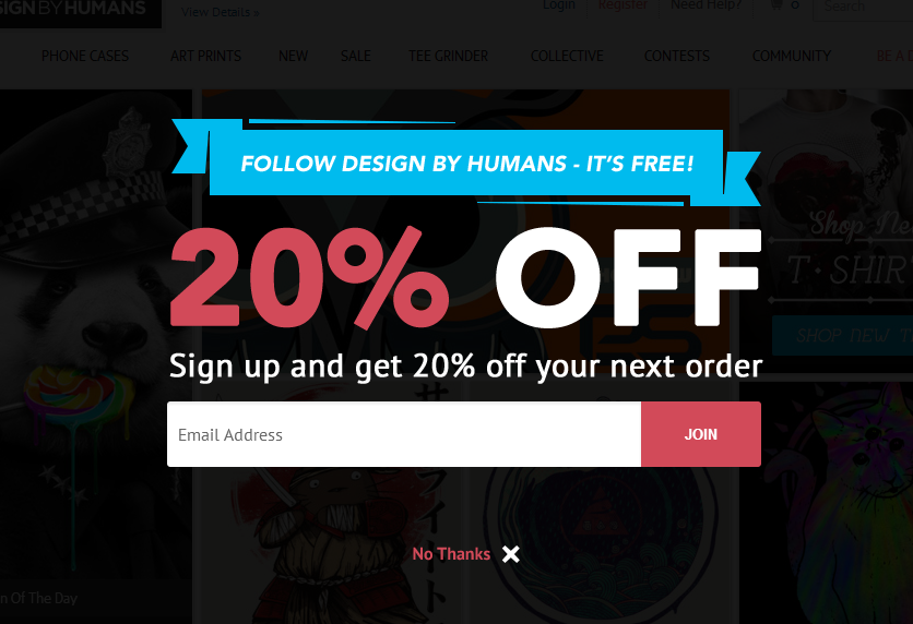
To 50%:
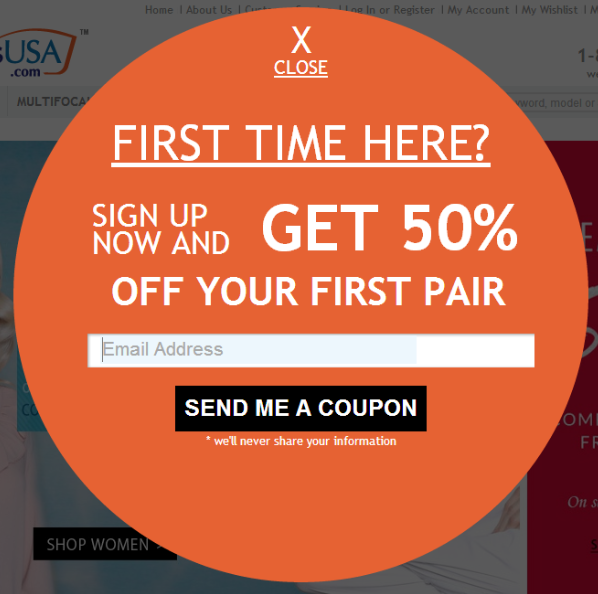
Or you could simply hand your customers an exclusive bag full of cash. It’s completely up to you.

9. Ask people to subscribe to the Newsletter

Target at: Repeat visitors, organic traffic
Place on: Content pages
Many businesses regularly send out their newsletters. These newsletters can contain a lot of valuable information for a subscriber. On certain occasions, they may even be compared to magazines.
You don’t need to always be super clever with your Exit Intent Popup:
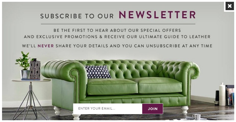
Sometimes it is self-evident that your content is good and valuable. A kind offer with seemingly no strings attached might be something that suits your style.
Of course, different strategies can again be combined to squeeze out the maximum result. You could be a little bit ambiguous by promising to offer something exclusive:
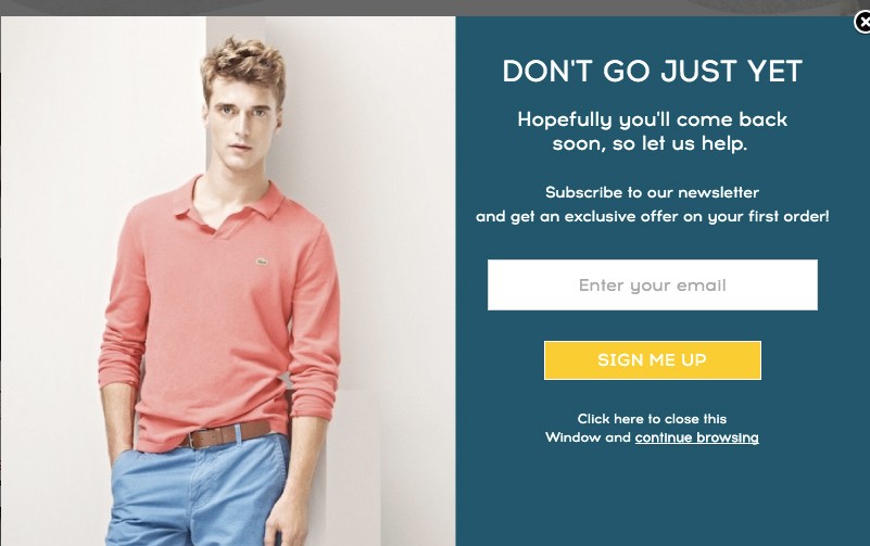
Or go with a straight-forward “Here’s your 5$ off and newsletter, give us your email” type of thing:
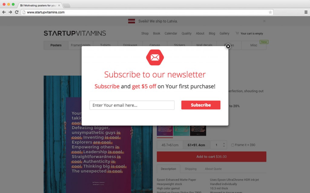
Either way, it is a quick and easy way to use Exit Intent Popups to collect the signups.
10. Trade New Content for an email signup

Target at: Organic traffic, repeat visitors
Place on: Content pages
This approach is essentially pretty similar to the last one. After all, what is a newsletter, if not a piece of new content? In fact, I would go as far as saying that newsletters are a classic, when it comes to fresh content.
This subparagraph, though, focuses on way more clever stuff. The ninja voodoo magic that people with brains the size of watermelons come up with. At the very least, they have a second portable brain in their pockets dedicated just for creative thinking. Like this guy over here:
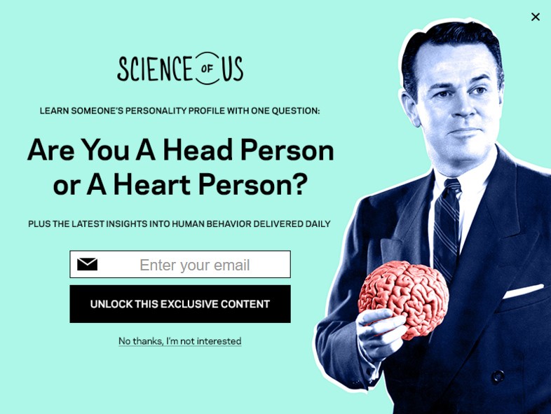
Okay, I might be over-exaggerating a little bit. But you’ve got to admit that regardless of what they’re even offering, this Exit Intent Popup from NYMAG looks pretty rad. I’d be tempted to submit my email address just to give them a thumbs-up for the design.
There’s a ton of different types of interesting content that your website visitors might be interested in, other than the traditional newsletters. With the help of Exit Intent Technology, all these ideas can be capitalized to generate some leads and signups.
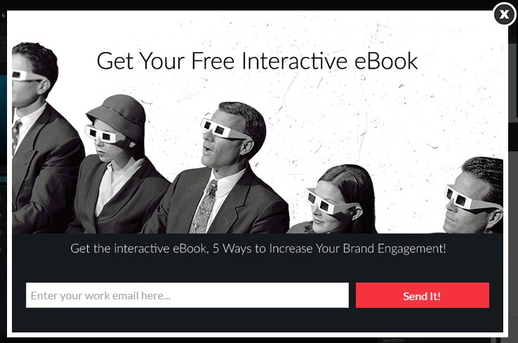
You could offer a free eBook:
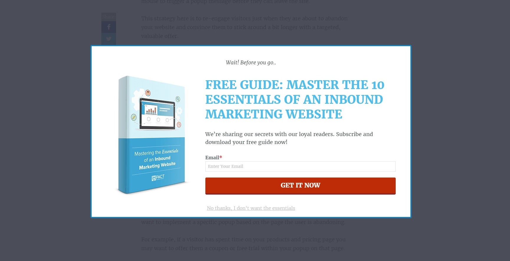
A useful Guide:
A comprehensive Checklist:
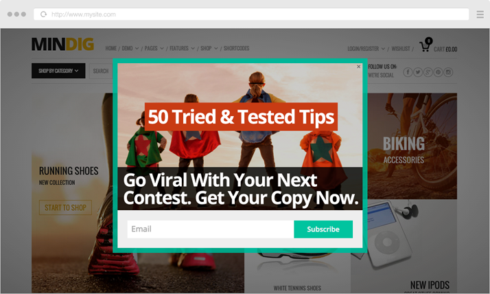
Or even an access to an Audio or a Video Podcast:
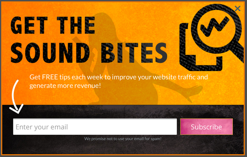
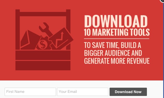
The good part, really, is that whatever the field your business is operating in, you could almost always think of something your users might be interested in. I mean, you could be offering
Marketing tools:
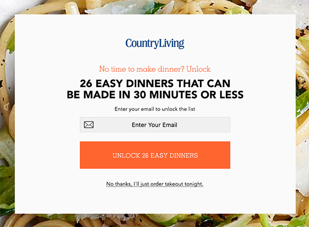
Dinner ideas:
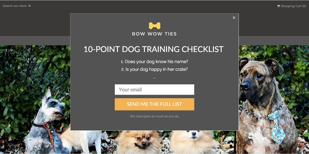
Dog training tips:
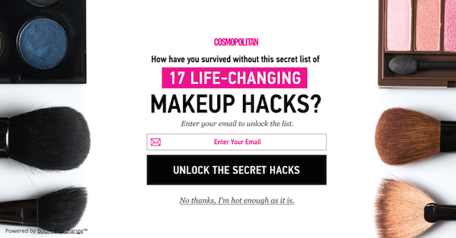
Make-up hacks:
Or Justin Bieber’s childhood diary, if you happen to own one:

It often comes down to personal preference, really, when choosing from all the endless possibilities.
11. Give website visitors a chance to Win Something

Target at: Everyone, emphasis on repeat visitors and organic traffic
Place on: Product pages, content pages
Who doesn’t like winning stuff?
Exactly! No one. Okay, maybe besides that one person you know, jeez… May I just… OK?
Instead of giving away discount coupons or free content, you could also offer your customers a chance to win something. Always in exchange for an email signup, of course:
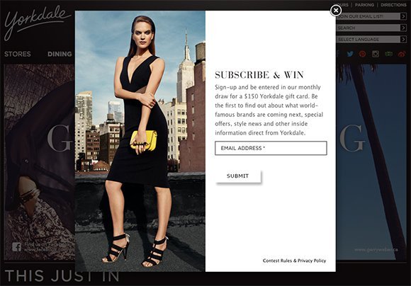
You don’t always have to even give away such expensive gifts as Yorkdale did. Sometimes a simple T-shirt might do the trick:
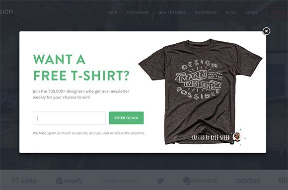
Surely you can think of something that your customers would be interested in. Keep in mind that a couple of T-shirts or a bumper sticker is almost a non-existent cost, compared to the value of email signups that you are gaining.
USE EXIT INTENT POPUP TO IMPROVE
CUSTOMER EXPERIENCE
Last but not least, a topic we have barely touched so far – Customer Experience. It might seem counter-intuitive that an Exit Intent Popup can actually be used to improve customer experience. After all, a majority of you would probably agree that popups are usually pretty annoying. So, where’s the catch?
12. Use the opportunity to get some Feedback

Target at: Repeat visitors, organic traffic
Place on: Everywhere
While keeping the doctor away takes some effort with all the apples ‘n’ stuff, keeping your customers away is a piece of cake (and it doesn’t even have to be an apple cake). Just ignore them. Never pay attention to what they are telling you, or which trails they are leaving behind.
If you have the opposite intentions – which I hope you do – you should also take the opposite action. Ask your clients what they have to say about you! Show them that you care. Show them you have a wish to improve. Do all those things and more.
There’s no easier way to collect some feedback than by kindly asking someone who was just about to leave your site. We are talking about EXIT INTENT popups, aren’t we? So, why not get straight to the core – ask them why they are exiting:
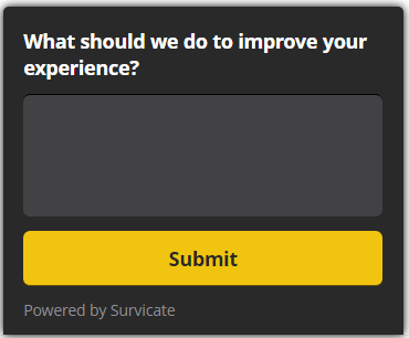
I don’t know about you, but I am not too keen on wasting a lot of my time and energy to give someone feedback about their website. That’s why I don’t expect others to have that kind of willingness either. Adding a list of responses may help out a little bit here:
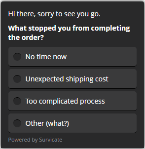
Instead of looking for the “Close” button, I might as well pick a response and be done with it. The data you collect might not be the most accurate (because of misclicks, randomly picked answers, etc), but you will still get some insight.
Have a guess why I like this next example, though:
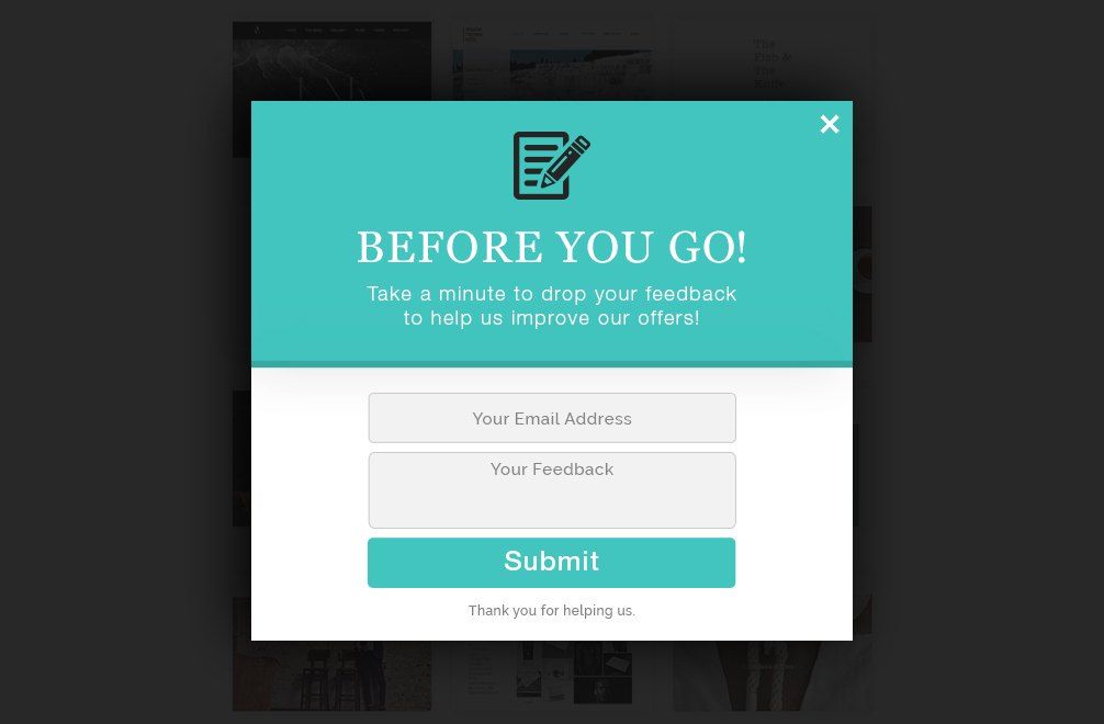
Bullz-eye. I like it when one bird catches two stones. How did the expression go again? Anyway, this was a brilliant example to illustrate that collecting feedback can be combined with lead generation.
13. Let customers know about New Features on website

Target at: Everyone or subscribed users
Place on: Everywhere
Certain brands have certain images – they are known for something. For instance, you don’t go to McDonald’s to have a fancy dinner. You go there for a quick burger and fries. If one day McDonald’s decided to add homemade meatloaf with potato-carrot mash and sun-dried tomatoes (worth, say, 17.5$) to their menu, they would make sure to give it a proper advertising.
Why? Because no one in their right mind would ever go there looking for such a dish. Why would anyone, who wants to have a fancy dinner, waste their time on going to a place that´s famous for being a fast food restaurant?
Now, I don’t know if that would be the smartest move that McDonald’s could ever go for. But it certainly helps to illustrate my next point:
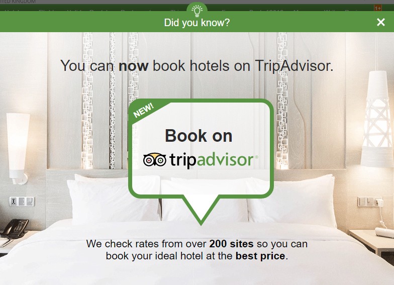
Many people have a rough idea what TripAdvisor is about. According to their website, they „provide travelers with the wisdom of the crowds to help them decide where to stay, how to fly, what to do and where to eat“.
At one point, they started offering the service of also booking a hotel on their site. In other words, they added potato-carrot mash to their list of products. Now, they couldn’t just write it down in the corner of their menus with a small font size and expect people to start ordering it. Instead, they used an Exit Intent Popup to let website visitors know about the news. Smart move.
YOUR TURN TO GET POPPIN’
As you’ve already understood, it’s all
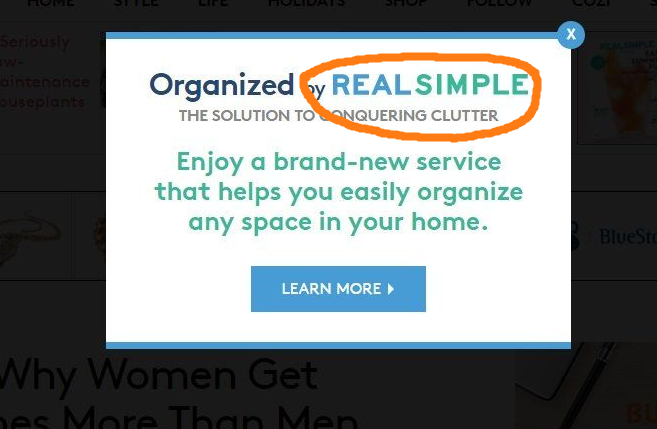
Aah, sorry, this was another example that was supposed to be in the last subparagraph. Oh well.
Anyway, I hope you all agree with me that this Exit Intent Popup thingy does not seem all that complicated. It’s all about birds and stones, and an occasional potato-carrot mash. If you still have any questions, though, I myself and my friends at MaxTraffic are more  than welcome to help you out.
I guess there’s only one reasonable thing left to do. Try out Exit Intent Popups for free on your website. Oh, and please, leave a comment and let us know how it went. We would be delighted to hear about your experience! Ciao for now!
