Wait, don’t go!
Knowing how to design exit-intent popup that does the job well is basically like figuring out how to automate well-targeted lead generation.
Actually, it’s exactly like that.
Imagine, you open this post, it’s hard to find anything special, and you’re thinking about leaving.
Well, that’s exactly how so many of your customers feel when visiting your website.
You know well, that the attention span of a internet-surfer is low. Your website is like a new toy in the hands of a three-year-old. If you don’t grab its attention immediately, you’ll end up in a pile of browser history never to be seen again.
So, when everything else fails, knowing how to design exit-intent popup is your last hope.
This is the first post in 4 post series where you will learn the following:
- Have a look at the exit-intent technology,
- See the practical examples of what works in the real world,
- How to design exit-intent popups that knocks your customer’s socks off.
1st Rule – Design is the King
First rule to remember when creating your popup is to make sure it fits seamlessly to what your customer experiences on the website in terms of design. You don’t want him to dismiss the message thinking it’s just another popup ad he encounters so often.
The design of Exit-Intent popup should therefore be in line with style of your website, matching the color scheme and typography to reasonable extent.
Good idea is to include logo of your company. That way you ensure that abandoning visitors treat the popup as a message from the website and not an intrusive offer.
Nevertheless, when it comes to exit-intent your popup should probably be in the middle of the screen and center of attention. There are only milliseconds between visitor deciding to leave and actually doing it. At that point, you have nothing to lose so go all-in!
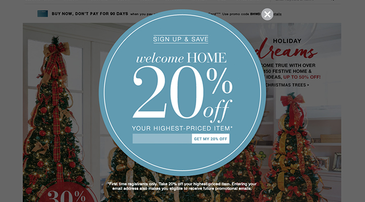
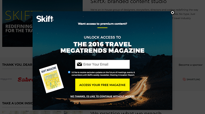
Exit Intent Design Examples
The difficult task for your designer is to find the sweet spot between clean design, clear message, and a beautiful design.
| Why it works? | What could you do better? |
|---|---|
|
|

| Why it works? | What could you do better? |
|---|---|
|
|
| Why it works? | What could you do better? |
|---|---|
|
|
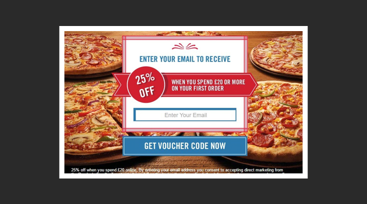
| Why it works? | What could you do better? |
|---|---|
|
|
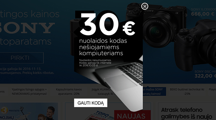
| Why it works? | What could you do better? |
|---|---|
|
|
Creating banner design
How can you get a great design?
At MaxTraffic we work with you on every aspect of your campaigns! We know how to target your customers, what message to present visitors with and we know what design elements to include.
Now, we can make it for you! Thought-through, personalized banner creations, made to match the style of your website.
Together, we can create the perfect weapon for abandoning visitors.
Do you know how to design exit-intent popup?
Crafting the perfect exit-intent popup that converts will take some time. So this post series on how to create exit-intent popup that scores new leads is something that you should really consider having a look at.
We made designing exit-intent popups into science with our 4 Rules that will surprise you.
Here are rest of the posts to help you on your journey to make exit-intent popup that scores the leads:
-
Part-2: How to Craft Exit-Intent Popup That Works – Focus on the Message
-
Part-3: How to Make Exit-Intent Popup That Works – Target the Right People
-
Part-4: How to Create Exit-Intent Popup That Works – Call to Action
You can also save your time and get all this info in our free eBook – 20 Exit-Examples and 4 Rules to Make Them Work.
