Over a month ago we spoke about the first rule to learn how to craft Exit-Intent popup that works and how the design is the king.
In this post we cover another important matter that directly affects the success of exit-intent performance.
2nd Rule: Focus on the Message
However attractive your Exit-Intent popup might be, all the effort will go to waste if the content doesn’t match the expectation of the customer. The key here which many tend to forget is that you need to “give some” in order to “get some”. If you don’t provide enough of an incentive for the client, you’re left with a desperate plea that has none chance of bringing any effect.
At the same time said incentive doesn’t necessarily have to be a huge discount or exclusive offer!
You’d be surprised how reinforcing message that was already centerpiece of your website can make the visitor reconsider. After all, he might’ve missed it, ignored it in search of something else or simply didn’t understand it.
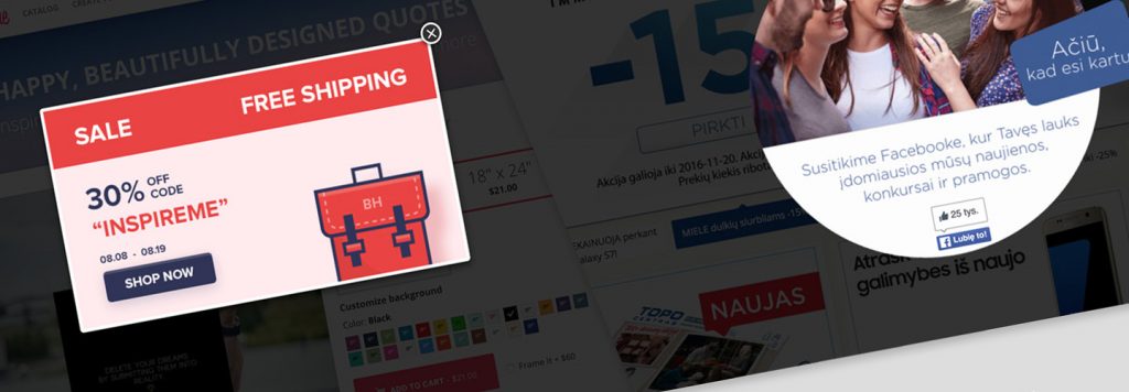
Exit Intent Message Examples
Good thing to remember is to be short and precise with your message, and don’t go into detailed explanations and requirements above what’s necessary – it’s not the place for that!
In most cases, the trick behind how to craft Exit-Intent popup is to grab attention – mentioning anything “free”, happening “only now” and especially “for you” gives you a significant advantage.
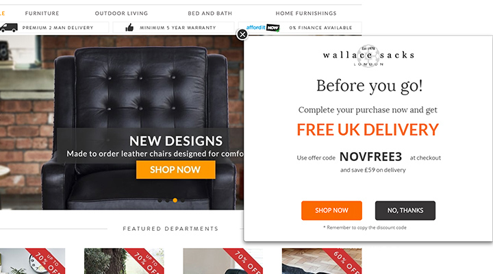
| Why it works? | What could you do better? |
|---|---|
|
|
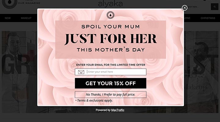
| Why it works? | What could you do better? |
|---|---|
|
|
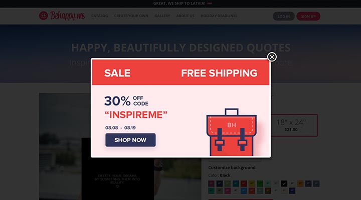
| Why it works? | What could you do better? |
|---|---|
|
|
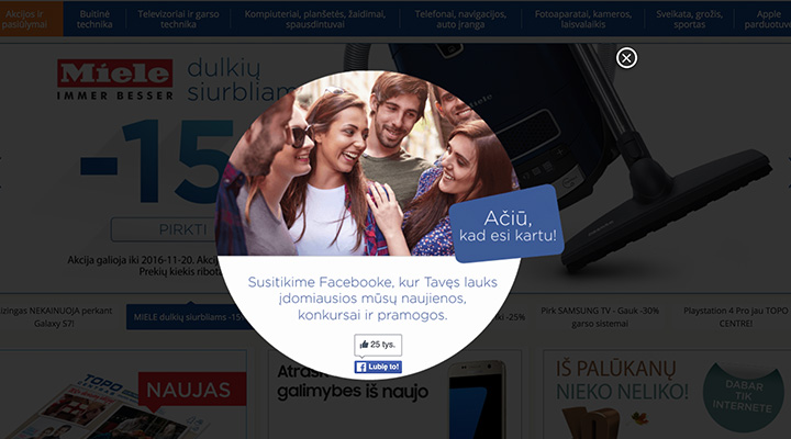
| Why it works? | What could you do better? |
|---|---|
|
|

| Why it works? | What could you do better? |
|---|---|
|
|
Getting content spot on
At MaxTraffic we have vast experience with partners across various markets – e-Commerce, finance, travel and news sites among others.
We know what works and why it does and we can help you reach even more traffic and convert them into paying customers.
Let us know what your problems are and we will help you find the perfect solution.
Do you know how to craft exit-intent popup message that converts?
Message should grab the attention. Keep it SIMPLE, Short and straight to the point.
That’s all there is. And of course, you always want to learn from the best. No need to make all the mistakes when someone already did it for you.
Keep on following our post series, here are the posts you might have missed.
-
Part-1: How to Design Exit-Intent Popup That Works – Design is The King
-
Part-3: How to Make Exit-Intent Popup That Works – Target the Right People
-
Part-4: How to Create Exit-Intent Popup That Works – Call to Action
You can also save your time and get all this info in our free eBook – 20 Exit-Examples and 4 Rules to Make Them Work.
