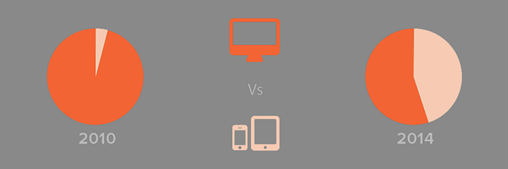
Analysts started predicting the rise of mobile traffic and explaining why mobile matters. Already back in 2008, Mary Meeker, a famous digital business analyst at Kleiner Perkins Caufield Byers predicted that mobile users would surpass fixed Internet access traffic by 2014.
It’s 2017 now, and we’re faced with the fact that we are indeed past the tipping point.
While vast majority of mobile Internet usage is credited to apps, browsing sites through mobile devices is also on the rise.
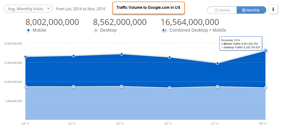
An alarming indicator of the increasing importance of mobile optimization for webmasters is mobile friendliness becoming a metric in Google search algorithms.
Mobile web access through various apps and browsing has surpassed surfing on desktops, and it’s high time you paid attention to it, or else you’re losing clients. A large part of them, actually. Let’s have a look at what drives your traffic away, and how you can fix it.
You Thought Linear Scaling Would Work
So everyone has heard why mobile matters and sites need be responsive.
The first and perhaps the heaviest mistake one could make would be simply telling the website to scale according to the screen size it’s viewed on. Apart from being hugely unimaginative, this strategy also fails for two obvious reasons:
- Your content becomes less valuable. Those enticing lines of copy and visuals that look just perfect on a desktop easily become redundant on a 5-inch mobile screen. They clutter the screen and make browsing a horrendous experience of never-ending scrolling and zooming.
- It makes clicking on anything a tremendously difficult task. Mouse-clickable links and buttons, when scaled to mobile sizes, are almost unclickable. This makes navigating through the site quite an irritating process, more than likely to scare your prospects away.

The solution is simple – if you want to use responsive design. Instead of creating a totally separate mobile site, make sure it truly is responsive:
- This means that every button, image and line of copy has to go in appropriate places when scaled down to mobile level.
- Static-size images and fixed layout schemes are a big no-no.
You Haven’t Put Your Priorities Straight
On desktop devices, you find plenty of room to fill with images, buttons, infographics, calls to action and sheer amounts of copy. On mobile platforms, however, your space is limited, literally. You have only a few seconds to convince your visitor to stay on the website. If you thought it was tough with desktops, mobile browsing is even less forgiving.
If you don’t prioritise your content so that your primary message displays first, you can expect your bounce rate to go up. Keep in mind that your priorities should align with your customer’s needs. You may want to start off with describing the whole history of your company, but that probably isn’t what your visitor is there for. Are your SEO efforts geared towards ranking high for selling socks? Then that’s the first thing they should be presented with upon visiting your site.

Your Site Loading Time is Horrible
According to Kissmetrics, 73% of consumers admit they’ve been frustrated by slow website loading times, while 47% expect a page to load in 2 seconds or less.
A large part of the problem is webmasters being used to uploading 24-bit PNGs directly to the site, without optimizing them. As an example not to follow, a single-page website by Oakley was discovered to weigh whooping 85.4MB, mostly due to non-optimized images.
Imagine the load time on mobile coverage!

The solution is technical. You can use a variety of image optimisation apps, such as ImageAlpha or ImageOptim. You will barely lose any quality, but you’ll be shrinking your page weights drastically.
Another huge bane to loading times is HTTP requests. Each one requires a separate connection, and too many of those jam up the bandwidth. It is a good idea to compile multiple CSS files into as few as possible to reduce page load times.
Multiple images converted into a single CSS sprite is a great way to reduce caching requests. Once the sprite is loaded, every image stored in it is ready for use.
I hope now you know why mobile matters!
It’s clear that mobile browsing isn’t something you can ignore any more than you can ignore the necessity of sleep or drinking water.
If you’re not optimizing your website for mobile users, you’re missing out on a huge opportunity.
Trying to cheapskate, thinking that “it’s a fad, it will pass” isn’t going to cut it. In order to tap into the market of mobile users, you need to pay attention to every technical detail and aspect of the layout and content of your site.