The challenge of selling in B2B niche is that the purchase of your products will always be high consideration decisions. Your prospects need quite a lot of specific information before they become a client. This is the main difference from B2C products, where brand recognition and image play a much larger role. Therefore your site must be top-notch – to make it happen here are B2B website best practices.
If you are wondering why does it matter if site is targeting consumers or businesses – here are the main differences:
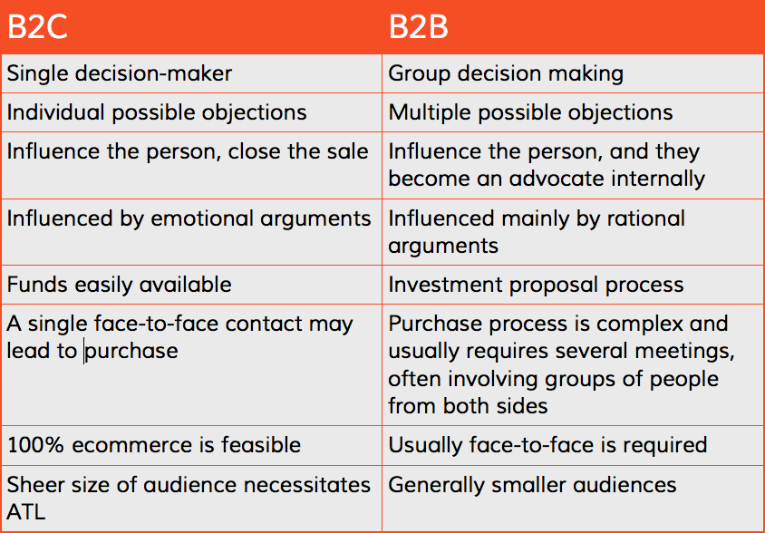
According to research performed by ITSMA, in B2B much more attention is paid to considering the options and weighing alternatives, and industry experts (which you, as the seller, want to establish yourself as) are listened to much more attentively than the buyer’s peers. This means that smart delivery of credible information is a cornerstone of the sales process, and that’s why B2B website best practices must be geared to do just that.
The Power of Information
While decision-making in a company is generally performed in groups, it doesn’t mean that you can’t gear your website towards a specific buyer modality. In fact, you can expect the majority people involved in the process to be the methodical buyers. Methodical buyers are those who take their time to consider all the information and options and truly do their research to find out what works best for them. If you gear your website towards this buyer modality, you can expect at least one of the decision-makers to become an advocate for your offer, helping clear up doubts and objections within the company.
They will want to see everything – your track record, past successes, testimonials, in-depth explanation of your offer and proof of its superiority. You can expect your prospect to read everything there is to read about your product and check out what the competitors are offering before even considering moving forward. This means that websites that focus on impulsive flash sales without backing it up with credible arguments will fail spectacularly.
This leads to the necessity of delivering as much information as possible to make you seem like the absolute authority in the field. And this is where most B2B marketers fail. Inability to group and present facts, figures and sound arguments for purchasing your product on your website drives the methodical buyer away, never to come back.
Putting it All Together
So, how do you appeal to the methodical CEO or senior executive of the company you want to do business with? Jakob Nielsen, a web-usability guru, offers his 10 website usability heuristics (problem solving strategies), which stay more or less consistent across all types and forms of online marketing. We’ve taken the ones we find most important in a B2B setting, and translated them into real, actionable tips:
Deliver your initial statement immediately
This can’t be stressed enough. Even though you may think that a high consideration product would require you to say everything there is to say about your offer right from the start, it will actually just ruin the first impression. The time to truly explain and inform comes later, first you have to deliver exactly what the prospect wanted to find when coming to your website – what you offer and why you think it’s the best thing out there. If convinced, the buyer will then start reading the hard facts and arguments presented on your website.
Optimize information flow through smart design
Guiding your buyer through pages and pages of arguments and facts about the industry and your product is similar to giving a university course. Considering the large amount of information you need to convey to your buyer, it’s absolutely imperative to lead users down a clear-cut path, delivering more and more information along the way, while at the same time making sure it doesn’t feel overwhelming.
This asks for smart design and navigation solutions, such as grouping content in an accordion. Every page needs to have a clear title, indication of its location on the site, and a way of leading your buyer to the next page.
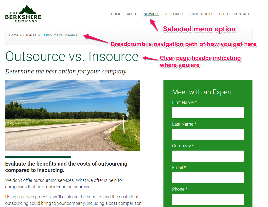
exactly where they are.
Put the user in control… kind of
Keep in mind that you will need to tell your client quite a story before you can seal the deal. This means you can’t pressure them to buy before they’re ready. They need to be able to go through all this information at their own pace and the best you can do is make sure there is nothing bothering them.
This means that auto-play videos, and some say even carousels are out of the question. Instead of flashy, dynamic content, incorporate CTAs and clearly indicative tabs signaling the user where to head next.
Now it’s your turn to share B2B website best practices
The key to a successful B2B website lies in combining fresh, easy-to-navigate design with a sheer amount of information seamlessly.
Your user has to be able to find everything they were looking for without feeling encumbered, or ever getting lost.
This is done through smart design, intuitive navigation and information grouping. Ultimately, you will be able to tell your visitor everything about even the most complex of products without it making feel like a chore on their side.